
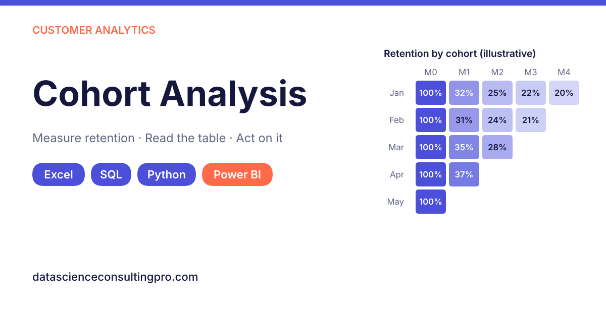
Cohort analysis groups customers by when they started (for example, the month of their first purchase or sign-up) and tracks how each group behaves over time, such as how many return, keep paying or spend more in the months that follow. Because each cohort is compared at the same age, it shows whether customers are sticking around better or worse than before, which overall averages hide.
This guide explains what cohort analysis is, how to read a cohort table, how to build one in Excel, SQL, Python and Power BI, and how to turn the patterns into decisions about onboarding, marketing, pricing and churn.
In this guide
- What is cohort analysis?
- Why cohort analysis beats averages
- A cohort analysis example
- Types of cohort analysis
- Key decisions before you start
- How to do cohort analysis step by step
- How to build a cohort table in Excel, SQL, Python and Power BI
- Revenue cohorts and net revenue retention
- From insight to action
- How cohort analysis fits with RFM, churn prediction and CLV
- Common mistakes
- Frequently asked questions
What Is Cohort Analysis?
A cohort is a group of customers who share a starting point in the same time period: everyone who first bought in January, everyone who signed up in week 12, everyone who joined through a particular campaign. Cohort analysis follows each group separately over time and compares them at the same “age”, for example month 1, month 2 and month 3 after joining.
The most common output is a cohort retention table: one row per cohort, one column per period since joining, and each cell showing the percentage of the cohort still active in that period.
Why Cohort Analysis Beats Averages
Total customer counts and average revenue mix new and old customers together. A business that acquires many new customers each month can show rising active users while each group of customers is actually leaving faster than before. The growth in sign-ups hides the leak.
Cohort analysis separates the two questions every growing business needs answered:
- Are we acquiring enough customers? (cohort size)
- Are the customers we acquire staying and spending? (cohort retention and revenue over time)
It also shows when customers drop off. A large fall between month 0 and month 1 points to a first-experience or onboarding problem; a slow decline later points to value, competition or product fit.
A Cohort Analysis Example
The table below is illustrative. It follows five monthly cohorts of an online store; “active” means the customer placed at least one order in that month.
Table 1. Illustrative Monthly Cohort Retention Table
| Cohort (first purchase) | Customers | Month 0 | Month 1 | Month 2 | Month 3 | Month 4 |
|---|---|---|---|---|---|---|
| January | 400 | 100% | 32% | 25% | 22% | 20% |
| February | 360 | 100% | 31% | 24% | 21% | |
| March | 420 | 100% | 35% | 28% | ||
| April | 380 | 100% | 37% | |||
| May | 450 | 100% |
The underlying counts are simple: for example, 128 of January’s 400 customers ordered again in month 1 (32%), and 141 of April’s 380 customers did (37%). Month 0 is always 100% because every customer is active in the month they joined, and the table is a triangle because newer cohorts have not yet reached later months. Those blank cells are not zeros.
How to Read a Cohort Table: Rows, Columns and Diagonals
- Read across a row to see how one cohort decays over time. January falls from 100% to 32% after one month, then flattens towards 20%. The flattening shows a core of repeat customers.
- Read down a column to compare cohorts at the same age. Month 1 retention rises from 31–32% in January and February to 35% in March and 37% in April. Something improved for customers acquired from March onwards.
- Read along a diagonal to spot calendar effects. Cells on the same diagonal fall in the same calendar month (for example, January’s month 3, February’s month 2 and March’s month 1 are all April). If one diagonal is unusually high or low across every cohort, the cause is probably something that happened that month, such as a sale, a stock-out or a holiday, rather than a difference between cohorts.
In this example, the improvement in month 1 retention coincided with a new post-purchase email sequence launched in March. That is a useful lead, but it needs checking against other changes in the same period, which is covered in the action section below.
Can’t produce this view from your own data yet? Our data science consulting team can build your first cohort table from a Shopify, Stripe, CRM or spreadsheet export. Start with a free data review.
Types of Cohort Analysis
Table 2. Types of Cohort Analysis
| Cohort type | How customers are grouped | Question it answers | Example |
|---|---|---|---|
| Acquisition cohort | By the period of first purchase, sign-up or subscription start | Are newer customers retained better or worse than older ones? | Monthly sign-up cohorts for a SaaS product |
| Behavioural cohort | By an action taken (or not taken) early on | Which early behaviours predict long-term retention? | Customers who used a key feature in week 1 vs those who did not |
| Channel or campaign cohort | By acquisition source within each period | Which channels bring customers who stay? | Paid social vs organic search vs referral customers |
| Revenue (value) cohort | Acquisition cohorts, measured by revenue instead of headcount | Does each cohort spend more or less over time? | Cumulative revenue per customer by cohort month |
Most businesses start with acquisition cohorts, then add behavioural and channel cuts once the basic table is trusted. When you want to group customers by value or purchase pattern rather than by start date, our guide to RFM analysis covers recency, frequency and monetary segmentation.
Key Decisions Before You Start
The same data can produce very different cohort tables depending on four choices. Make them deliberately and write them down.
- Cohort period. Weekly cohorts suit apps and fast-moving products; monthly cohorts suit most e-commerce and SaaS businesses; quarterly cohorts suit B2B or high-value purchases with long buying cycles. Match the period to how often customers naturally buy or use the product.
- Activity event. Decide what counts as “active”: a purchase, a login, an active paid subscription, or a specific action. A login-based table and a purchase-based table answer different questions.
- Retention definition.
- Classic (period-N) retention: the share of the cohort active in period N.
- Unbounded (rolling) retention: the share active in period N or any later period. It is always at least as high as classic retention and suits products used irregularly. State which one you use; mixing them makes comparisons meaningless.
- Minimum cohort size. Percentages from small cohorts swing widely: one customer in a cohort of 20 is 5 percentage points. If cohorts are small, use longer periods (quarters instead of months) or flag cells based on fewer than a set number of customers.
How to Do Cohort Analysis Step by Step
These steps work in any tool.
- Collect the data. You need one row per transaction or activity event with at least a customer ID and a date. Add revenue, channel or plan if you want those cuts.
- Clean it. Remove test orders and duplicates, merge duplicate customer IDs, and standardise dates and time zones. Cohort tables magnify data problems, so this step matters; see our guide to data quality management.
- Assign each customer to a cohort. Find each customer’s first activity date and convert it to the cohort period (for example, the month of the first order).
- Calculate the period index. For every activity, count how many periods have passed since the customer’s cohort period (0 for the first month, 1 for the next, and so on).
- Count active customers. For each cohort and period index, count distinct customers with at least one activity.
- Divide by cohort size. Divide each count by the number of customers in that cohort at period 0 to get retention percentages.
- Visualise and review. Display the table as a heatmap and plot retention curves, then read rows, columns and diagonals as described above.
- Decide and monitor. Agree what action the pattern suggests, then keep the table updating so you can see whether later cohorts respond.
Your data in Shopify, Stripe, your CRM or a spreadsheet? Send us an export and we will build your first cohort table and tell you what it shows. Book a free data review. If the export needs work first, our data cleaning services handle duplicates, mismatched IDs and inconsistent dates.
How to Build a Cohort Table in Excel, SQL, Python and Power BI
Table 3. Cohort Analysis Tools Compared
| Tool | Best for | Skill level | Strengths | Limitations |
|---|---|---|---|---|
| Excel or Google Sheets | One-off analysis, up to tens of thousands of rows | Beginner | Familiar, quick to share | Manual refresh; slows with large data |
| SQL | Data already in a database or warehouse | Intermediate | Handles millions of rows; reusable query | Needs database access; output still needs a chart |
| Python (pandas) | Analysts who also want curves, revenue cohorts or modelling | Intermediate | Flexible; easy to extend to churn models | Needs a coding environment |
| Power BI or Tableau | Ongoing reporting for managers | Intermediate | Refreshes automatically; interactive filters | Setup takes longer; measures must be defined carefully |
Each example assumes an orders table with customer_id, order_date and, for revenue cohorts, revenue.
Excel
- Put your orders in a table with columns CustomerID (A), OrderDate (B) and Revenue (C).
- Add a FirstOrder column:
=MINIFS($B:$B, $A:$A, A2). - Add a CohortMonth column:
=DATE(YEAR(D2), MONTH(D2), 1), formatted as month and year. - Add a MonthNumber column:
=(YEAR(B2)-YEAR(E2))*12 + MONTH(B2)-MONTH(E2). - Insert a PivotTable and tick Add this data to the Data Model (this enables distinct counts).
- Put CohortMonth in Rows, MonthNumber in Columns and CustomerID in Values, then change the value setting to Distinct Count.
- Next to the pivot, divide each cell by the month 0 cell in the same row (for example
=C5/$B5) and apply Conditional Formatting → Color Scales to create a heatmap.
Google Sheets works the same way with MINIFS and a pivot table using COUNTUNIQUE.
SQL
This version uses PostgreSQL syntax:
WITH first_purchase AS (
  SELECT customer_id,
         DATE_TRUNC('month', MIN(order_date)) AS cohort_month
  FROM orders
  GROUP BY customer_id
),
activity AS (
  SELECT DISTINCT o.customer_id,
         f.cohort_month,
         DATE_TRUNC('month', o.order_date) AS activity_month
  FROM orders o
  JOIN first_purchase f USING (customer_id)
),
indexed AS (
  SELECT cohort_month,
         customer_id,
         (EXTRACT(YEAR FROM activity_month) - EXTRACT(YEAR FROM cohort_month)) * 12
       + (EXTRACT(MONTH FROM activity_month) - EXTRACT(MONTH FROM cohort_month)) AS month_number
  FROM activity
),
cohort_size AS (
  SELECT cohort_month, COUNT(*) AS customers
  FROM first_purchase
  GROUP BY cohort_month
)
SELECT i.cohort_month,
       i.month_number,
       COUNT(DISTINCT i.customer_id) AS active_customers,
       s.customers AS cohort_size,
       ROUND(100.0 * COUNT(DISTINCT i.customer_id) / s.customers, 1) AS retention_pct
FROM indexed i
JOIN cohort_size s USING (cohort_month)
GROUP BY i.cohort_month, i.month_number, s.customers
ORDER BY i.cohort_month, i.month_number;
The query returns one row per cohort and month; pivot it in your BI tool or spreadsheet. In BigQuery, use DATE_TRUNC(order_date, MONTH) and DATE_DIFF(activity_month, cohort_month, MONTH); in Snowflake, DATEDIFF('month', cohort_month, activity_month) replaces the month arithmetic.
Python
import pandas as pd

orders = pd.read_csv("orders.csv", parse_dates=["order_date"])

# 1. Order month and each customer's cohort month
orders["order_month"] = orders["order_date"].dt.to_period("M")
orders["cohort_month"] = orders.groupby("customer_id")["order_month"].transform("min")

# 2. Months since the customer's first order
orders["month_number"] = (orders["order_month"] - orders["cohort_month"]).apply(lambda x: x.n)

# 3. Distinct active customers per cohort and month
counts = (orders.groupby(["cohort_month", "month_number"])["customer_id"]
                .nunique()
                .unstack())

# 4. Divide by cohort size (month 0) to get retention %
retention = counts.divide(counts[0], axis=0).round(3) * 100
print(retention)
To draw a heatmap, pass retention to seaborn.heatmap(retention, annot=True, fmt=".0f"). For revenue cohorts, replace nunique() on customer_id with sum() on revenue. New to pandas? Start with our guide to Python for data analysis.
Power BI
- Load the orders table and add two calculated columns in DAX:
CohortMonth =
VAR FirstDate =
    CALCULATE ( MIN ( Orders[OrderDate] ), ALLEXCEPT ( Orders, Orders[CustomerID] ) )
RETURN
    DATE ( YEAR ( FirstDate ), MONTH ( FirstDate ), 1 )

MonthNumber = DATEDIFF ( Orders[CohortMonth], Orders[OrderDate], MONTH )- Create three measures:
Active Customers = DISTINCTCOUNT ( Orders[CustomerID] )

Cohort Size =
CALCULATE ( DISTINCTCOUNT ( Orders[CustomerID] ), ALLEXCEPT ( Orders, Orders[CohortMonth] ) )

Retention % = DIVIDE ( [Active Customers], [Cohort Size] )- Add a Matrix visual with CohortMonth in Rows, MonthNumber in Columns and Retention % in Values, then apply a background colour scale under Conditional formatting.
Once built, the matrix refreshes with your data source, so new cohorts appear automatically. For the wider dashboard setup, see how to create a dashboard in Power BI or, if your team uses Tableau, how to create a dashboard in Tableau. If you would rather have a retention dashboard built and connected to your data, our dashboard development services cover design, data connections and automatic refresh.
Revenue Cohorts and Net Revenue Retention
Counting customers tells you who stays; tracking revenue tells you what they are worth. A revenue cohort table shows, for each acquisition cohort, the revenue (or cumulative revenue per customer) in each period since joining. A cohort can lose customers but still grow in value if the customers who remain buy more often or upgrade.
Subscription businesses usually summarise this with two commonly used measures:
- Net revenue retention (NRR) = (starting recurring revenue from existing customers + expansion − contraction − churned revenue) ÷ starting recurring revenue × 100
- Gross revenue retention (GRR) = (starting recurring revenue − contraction − churned revenue) ÷ starting recurring revenue × 100
Illustrative example. A group of customers starts the year paying 10,000 a month in total. During the year, upgrades add 1,200, downgrades remove 300 and cancellations remove 900.
- NRR = (10,000 + 1,200 − 300 − 900) ÷ 10,000 = 100%
- GRR = (10,000 − 300 − 900) ÷ 10,000 = 88%
GRR cannot exceed 100% because it ignores expansion; NRR above 100% means expansion from existing customers more than offsets losses. What counts as a “good” figure depends on your business model, price point and customer type, so the most useful benchmark is your own earlier cohorts. For a wider look at revenue trends, see our guide on how to analyze sales data; for expert help, our sales performance analytics package is a fixed-scope option for reviewing what drives your sales and revenue.
From Insight to Action: What Cohort Patterns Tell You
Table 4. What Cohort Patterns Tell You and What to Do
| Pattern in the table | Likely meaning | Possible action | Check before acting |
|---|---|---|---|
| Sharp drop between month 0 and month 1 in every cohort | First experience or onboarding does not give customers a reason to return | Improve onboarding, post-purchase emails, first-order offers | Is the drop similar across channels and products? |
| Newer cohorts retain better than older ones | A recent change is working | Keep and extend the change; document what changed and when | Did the channel mix, season or pricing also change? |
| Newer cohorts retain worse | Lower-quality acquisition, or a product or service problem | Review channels, targeting, discounts and recent product changes | Compare by channel and campaign before blaming the product |
| Curves flatten at a stable level | A loyal core of repeat customers | Focus retention offers and loyalty schemes on reaching that plateau sooner | Is the plateau large enough to support growth? |
| One diagonal is high or low across all cohorts | A calendar event affected everyone that month | Account for it in planning; do not over-read it | Match the date to promotions, stock-outs, outages or holidays |
| Retention falls but revenue per cohort holds | Fewer but higher-value customers remain | Segment remaining customers by value; protect the top segment | Check whether price increases drove the change |
The most common analytical error is to attribute an improvement to one change when several things changed at once. Before acting, compare cohorts by acquisition channel and campaign, and check what else happened in the same months.
For online stores and SaaS products, cohort patterns become most useful when combined with funnel, conversion and product-usage data. Our digital and product analytics services bring these together so you can see which behaviours separate customers who stay from customers who leave.
Cohort Analysis, RFM, Churn Prediction and CLV: How They Fit Together
- Cohort analysis shows when customers leave and whether newer groups behave differently.
- RFM analysis shows who your most and least valuable customers are right now.
- Churn prediction estimates which individual customers are likely to leave next, so you can act before they do.
- Customer lifetime value (CLV) estimates how much a customer is worth over the relationship; cohort revenue curves are one of the most practical inputs.
Used together, they move a business from describing retention to managing it. Our guide on using data to improve customer experience covers the wider set of customer KPIs. When you are ready to predict churn at the customer level, our predictive analytics services build and validate those models, and our customer churn prediction project is a fixed-scope option with a stated duration of about four weeks.
To keep cohort tables updating alongside your other KPIs, they belong in your regular reporting; see our guide to business dashboards, or let our business intelligence services set up the data model and reporting routine.
Common Cohort Analysis Mistakes
- Mixing retention definitions, such as comparing classic and unbounded retention across reports.
- Treating blank cells as zero, which makes newer cohorts look as if everyone left.
- Drawing conclusions from tiny cohorts, where one customer moves the percentage by several points.
- Using the wrong denominator, such as dividing by customers active last month instead of the original cohort size.
- Choosing a period that does not match the buying cycle, for example weekly cohorts for a product bought twice a year.
- Ignoring calendar effects visible on the diagonal.
- Attributing changes to a single cause without checking channel mix, seasonality and pricing.
- Skipping data cleaning, so duplicate customer IDs split one customer into several cohorts.
- Looking only at headcount, and missing revenue expansion or contraction within cohorts.
- Building the table once and never updating it, so you cannot see whether later cohorts respond to the changes you made.
What You Get When We Run Your Cohort Analysis
If you would rather have experts build and interpret it, a typical cohort analysis engagement includes:
- A data review of your order, subscription, CRM or product-usage exports
- Cleaned customer and transaction data, with duplicates and ID mismatches resolved
- Cohort retention and revenue tables, with clearly stated definitions
- A heatmap and retention curves that are easy to present to leadership
- A short findings report explaining what the patterns mean and which actions to test first
- An optional Power BI or Tableau dashboard that refreshes as new data arrives
- Optional next steps, such as churn-risk scoring or customer lifetime value estimates
Pricing is quote-based and depends on the scope and deliverables, the size and quality of your data, the number of data sources, the complexity of the analysis, your tech stack and your timeline; projects can be fixed-price or hourly-range. We report what the data shows and the uncertainty around it, and we do not promise specific retention or revenue outcomes.
Frequently Asked Questions
A cohort is a group of people who share a common starting characteristic within the same time period, most often the month or week they first purchased or signed up. Cohort analysis follows these groups separately over time.
Segmentation groups customers by attributes or behaviour at a point in time, such as value or location. Cohort analysis groups them by when they started and tracks each group over time. The two work well together, for example by comparing retention of high-value and low-value segments within each cohort.
There is no universal figure. Good retention depends on your business model, price point and how often customers naturally buy. The most reliable benchmark is your own history: newer cohorts retaining better than older ones is a strong sign of progress.
There is no fixed minimum, but percentages from cohorts of a few dozen customers swing widely. If your cohorts are small, use longer periods (such as quarters) or flag cells based on low counts before drawing conclusions.
Match the cohort period to your customers’ natural usage or buying cycle. Weekly cohorts suit apps and frequently used products; monthly cohorts suit most e-commerce and subscription businesses; quarterly cohorts suit B2B or infrequent, high-value purchases.
Cohort analysis tracks groups over time from their start date to show when customers drop off. RFM scores current customers on recency, frequency and monetary value to show who is most valuable now. Cohorts answer “are we keeping customers better than before?”; RFM answers “who should we focus on today?”
Yes. Add a first-purchase date and a month-number column, build a pivot table with distinct customer counts by cohort and month, and divide each cell by the cohort’s month 0 count. Spreadsheets work well up to tens of thousands of rows; beyond that, SQL or Python is faster.
It shows exactly when customers leave and whether changes you make are helping newer cohorts stay longer. That tells you where to focus (for example, the first month) and lets you measure whether onboarding, pricing or product changes are working.
Conclusion
Cohort analysis replaces a single blended number with a clear view of whether customers are staying, returning and spending more over time. Define your cohorts and retention rule carefully, read the table across rows, down columns and along diagonals, and check other explanations before acting on a pattern. Built once and kept updated, it becomes one of the most useful reports a growing business can have.
Signs you need cohort analysis now:
- Acquisition costs are rising and you need to know whether new customers are worth it
- Revenue is flat even though you keep adding customers
- You changed onboarding, pricing or the product and cannot tell whether it worked
- Investors or your board are asking about retention
- Your Shopify, Stripe, CRM and finance numbers do not agree
If any of these sound familiar, our data analysis services can turn your exports into a clear cohort report and a plan of what to test next.
Request a Proposal · Book a consultation · See how pricing works
