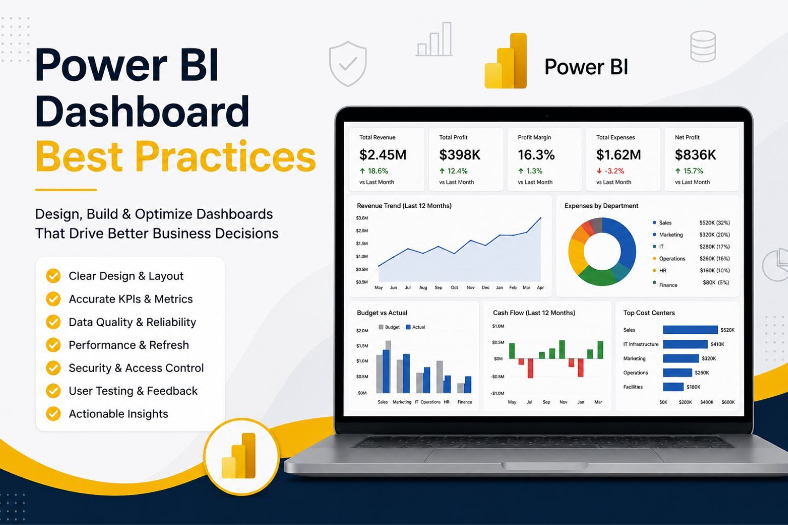
How to Create a Dashboard in Power BI: Complete Step-by-Step Guide
A Power BI dashboard helps businesses turn raw data into clear, visual insights that support faster and better decisions. Instead of relying on separate spreadsheets, manual reports, email updates, and disconnected charts, a well-built dashboard brings the most important KPIs into one focused view. This makes it easier for managers, analysts, executives, and business owners to monitor revenue, profit, sales trends, customer activity, expenses, operations, marketing performance, and other key business metrics.
If you want to learn how to create a dashboard in Power BI, the process should not start with charts. It should start with a clear business question, clean data, reliable KPIs, and a dashboard layout that helps users understand what matters quickly. A professional dashboard is not just attractive; it must be accurate, easy to use, secure, refreshed on time, and designed around real business decisions.
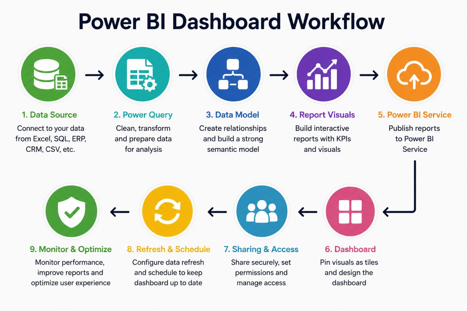
In this guide, you will learn how to create a Power BI dashboard from start to finish. You will see how to prepare your data, import it into Power BI Desktop, clean it with Power Query, build a data model, create measures, design report visuals, publish to Power BI Service, create dashboard tiles, set up refresh, share securely, and avoid common dashboard mistakes. You will also see practical guidance on pricing, trust factors, conversion, live dashboards, governance, and when to hire a Power BI dashboard consultant.
What Is a Power BI Dashboard?
A Power BI dashboard is a single-page visual summary that displays the most important business metrics in one place. It usually contains pinned visuals, KPI cards, charts, tables, and tiles that help users monitor performance without opening several detailed report pages. In most Power BI workflows, you build the report and data model first, then publish the report to Power BI Service and create the dashboard by pinning selected visuals. Microsoft explains that dashboards in Power BI are created from visuals pinned from reports in the Power BI Service.
This distinction is important because many beginners think dashboards are created directly inside Power BI Desktop. Power BI Desktop is mainly used for importing data, cleaning data, building relationships, creating measures, and designing reports. Power BI Service is where you publish reports, create dashboards, manage workspaces, configure refresh, and share dashboards with users. Microsoft’s Power BI Service concepts also separate key items such as reports, dashboards, semantic models, workspaces, and apps.
A dashboard should give users a fast answer to the most important business questions. For example, a sales dashboard may show total revenue, profit margin, monthly sales trend, top products, regional performance, and sales target progress. A financial dashboard may show revenue, expenses, budget variance, cash flow trend, and net profit.
| Power BI Element | Meaning | Simple Example |
|---|---|---|
| Data source | Where the data comes from | Excel, SQL Server, CRM, ERP, CSV |
| Power Query | Tool for cleaning and transforming data | Remove duplicates, fix dates, rename columns |
| Semantic model | Structured model behind reports | Sales table linked to product and date tables |
| Report | Interactive pages with visuals | Sales analysis report with filters and charts |
| Visual | A chart, card, table, slicer, or map | Revenue card, sales trend chart |
| Dashboard | Single-page KPI monitoring view | Executive sales dashboard |
| Tile | A pinned visual on a dashboard | Total revenue tile |
| Workspace | Shared Power BI Service area | Finance reporting workspace |
| App | Packaged reports and dashboards for users | Management reporting app |
Power BI Report vs Dashboard
A Power BI report and a Power BI dashboard are connected, but they are not the same. A report is usually more detailed and may contain several pages, filters, slicers, drill-through pages, and analytical views. A dashboard is usually a single-page summary designed for quick monitoring and high-level decision-making.
Reports are best when users need to explore the data. Dashboards are best when users need to monitor key metrics quickly. For example, a sales manager may use a report to investigate revenue by salesperson, product, region, customer type, and date. An executive may use a dashboard to see total revenue, profit margin, sales growth, and top-performing regions at a glance.
| Feature | Power BI Report | Power BI Dashboard |
|---|---|---|
| Main purpose | Detailed analysis | High-level monitoring |
| Number of pages | One or many pages | Usually one page |
| Created in | Power BI Desktop or Power BI Service | Power BI Service |
| Interactivity | More detailed interactivity | More focused interactivity |
| Best use case | Exploring data | Monitoring KPIs |
| Visual source | Built from the data model | Pinned from reports |
| User type | Analysts, managers, data teams | Executives, managers, stakeholders |
| Example | Full sales analysis report | CEO revenue dashboard |
What You Need Before Creating a Power BI Dashboard
Before you build your dashboard, you need a strong foundation. Most dashboard problems are caused by poor data quality, unclear KPIs, weak dashboard planning, or missing refresh settings. A dashboard may look attractive, but if the numbers are wrong or the data is outdated, users will quickly lose trust in it.
Start by deciding what the dashboard should help users understand. The goal may be to monitor revenue, compare regional performance, track expenses, analyze marketing campaigns, follow customer trends, or measure operational efficiency. Once the goal is clear, you can select the right data sources, KPIs, visuals, and dashboard structure.
| Requirement | Why It Matters |
|---|---|
| Power BI Desktop | Used to import, clean, model, and design reports |
| Power BI Service | Used to publish, create dashboards, share, and refresh |
| Clean dataset | Prevents wrong KPIs and misleading visuals |
| Defined KPIs | Keeps the dashboard focused |
| Business goal | Helps users make decisions |
| Data source | Excel, SQL, CRM, ERP, CSV, SharePoint, or cloud apps |
| Refresh plan | Keeps the dashboard current |
| Security plan | Controls who can view sensitive data |
A useful dashboard should answer a clear business question. Before opening Power BI, ask: What decision should this dashboard support? That one question helps you avoid unnecessary visuals, confusing metrics, and cluttered layouts.
Step 1: Define the Dashboard Purpose
The first step is to define the purpose of the dashboard. Many people open Power BI and immediately start adding charts, but that often leads to dashboards that look busy and fail to answer the most important questions. A professional dashboard should begin with the user’s decision-making needs.
For example, a sales dashboard may be designed to help managers understand whether revenue is growing, which products are performing best, which regions are underperforming, and whether salespeople are reaching their targets. A finance dashboard may help leaders track expenses, profit, budget variance, and cash flow. An operations dashboard may help teams monitor orders, inventory, delays, and service performance.
| Business Goal | Dashboard Question | KPI | Recommended Visual |
|---|---|---|---|
| Increase revenue | Are sales growing or declining? | Total revenue, sales growth | KPI card, line chart |
| Improve profit | Which products are most profitable? | Profit, profit margin | Bar chart, matrix |
| Control expenses | Are costs within budget? | Budget variance | Waterfall chart |
| Track customers | Which customers generate the most value? | Customer revenue | Bar chart, table |
| Monitor regions | Which region performs best? | Sales by region | Map, bar chart |
| Improve marketing | Which channel converts best? | Conversion rate | Funnel, bar chart |
A good dashboard does not show everything. It shows the right things clearly. This is one of the biggest differences between a basic tutorial dashboard and a professional business dashboard.
Step 2: Prepare and Clean Your Data
Clean data is the foundation of every useful Power BI dashboard. If your dataset contains duplicates, missing values, inconsistent dates, merged Excel cells, incorrect formats, or unclear column names, your dashboard may produce misleading results. The problem is that users may trust the dashboard because it looks professional, even when the underlying data is weak.
Use Power Query to clean and transform the data before building visuals. Power Query can remove duplicates, fix date fields, rename columns, filter unnecessary rows, merge tables, split columns, correct data types, and prepare the data for modeling. This step improves accuracy and makes the dashboard easier to maintain.
| Cleaning Task | Example |
|---|---|
| Remove duplicates | Delete repeated customer or order rows |
| Fix missing values | Replace blank regions or product categories |
| Standardize dates | Convert text dates into date fields |
| Rename columns | Change Rev_Amt to Revenue |
| Correct formats | Ensure sales and profit are numeric |
| Remove unused columns | Delete notes or irrelevant fields |
| Split columns | Separate full name into first and last name |
| Merge tables | Combine sales data with product data |
If you are using Excel, structure your data as a clean table before importing it into Power BI. Avoid merged cells, blank header rows, subtotal rows, repeated headings, and manually formatted summaries. Power BI works best when the source data is organized consistently.
Businesses with messy spreadsheets can benefit from professional Data Cleaning Services before building dashboards. Clean data improves accuracy, reduces manual correction, and makes the final dashboard easier to trust.
Step 3: Import Data into Power BI Desktop
After preparing the data, open Power BI Desktop and connect to your data source. Power BI can import data from Excel, CSV files, SQL Server, SharePoint, cloud platforms, web sources, and many other systems. The right source depends on where your business stores its data and how often the dashboard needs to update.
The basic process is simple. Open Power BI Desktop, select Get Data, choose your source, preview the tables, and decide whether to load or transform the data. Choose Load only when your dataset is already clean. Choose Transform Data when you need to clean, reshape, merge, filter, or correct the data before analysis.
If your business data comes from multiple systems, importing data without a plan can create confusion. For example, sales may be stored in a CRM, expenses in accounting software, inventory in an ERP system, and targets in Excel. In that case, the dashboard needs careful data modeling so the different sources work together correctly.
For multi-source reporting, Business Intelligence Services can help connect scattered business systems and turn them into a reliable reporting structure.
Step 4: Build the Data Model
A strong data model makes your dashboard accurate, scalable, and easier to maintain. Many beginners use one large flat table, but that approach can become slow and confusing as the data grows. A better structure is often a star schema, where a main fact table connects to smaller dimension tables.
For a sales dashboard, the sales table may store transaction-level data such as order ID, date, product ID, customer ID, revenue, and profit. Dimension tables may include products, customers, dates, regions, and salespeople. This structure makes it easier to analyze performance by time, product, location, and customer segment.
| Table | Purpose | Example Fields |
|---|---|---|
| Sales | Stores transaction data | Order ID, date, product ID, customer ID, revenue |
| Products | Stores product details | Product ID, product name, category |
| Customers | Stores customer details | Customer ID, customer name, segment |
| Date | Supports time-based analysis | Date, month, quarter, year |
| Region | Groups location data | Region ID, country, sales territory |
The data model should be tested before building the final dashboard. Check that relationships are correct, filters behave as expected, and totals match trusted source data. A visually attractive dashboard is not useful if the model behind it calculates the wrong numbers.
Step 5: Create Measures and KPIs
Measures help calculate the numbers that appear in your dashboard. In Power BI, many measures are created using DAX. You do not need advanced DAX for every dashboard, but basic measures are important for KPIs such as total sales, profit margin, average order value, budget variance, and year-to-date performance.
Simple DAX measures may include total sales, total profit, profit margin, order count, and average order value. These measures should match the business definition of each KPI. For example, “profit margin” should be calculated the same way finance, management, and sales teams understand it.
Total Sales = SUM(Sales[Revenue])

Total Profit = SUM(Sales[Profit])

Profit Margin = DIVIDE([Total Profit], [Total Sales])

Order Count = COUNTROWS(Sales)

Average Order Value = DIVIDE([Total Sales], [Order Count])| Measure | Meaning |
|---|---|
| Total Sales | Adds all sales revenue |
| Total Profit | Adds all profit values |
| Profit Margin | Shows profit as a percentage of sales |
| Order Count | Counts transactions |
| Average Order Value | Calculates average revenue per order |
Do not overload the dashboard with too many KPIs. A dashboard with five to ten meaningful metrics is usually stronger than one with twenty numbers that users cannot interpret quickly. The goal is clarity, not decoration.
Step 6: Choose the Right Dashboard Visuals
The best Power BI dashboard visuals depend on the question you want to answer. KPI cards are useful for showing headline numbers, line charts are useful for trends, bar charts are useful for comparisons, and matrices are useful when users need more detail. Maps can be useful for geographic data, but they should only be used when location is truly important.
Each visual should earn its place on the dashboard. If a chart does not help users understand performance, compare results, spot a problem, or make a decision, it should be removed. Too many visuals make a dashboard harder to read and reduce user trust.
| Visual | Best Use | Example |
|---|---|---|
| KPI card | One important number | Total revenue |
| Line chart | Trend over time | Monthly sales |
| Bar chart | Category comparison | Sales by product |
| Matrix | Detailed comparison | Sales by region and product |
| Map | Geographic data | Revenue by country |
| Gauge | Progress to target | Sales target achievement |
| Waterfall chart | Explaining change | Profit movement |
| Slicer | Filtering data | Region, product, date |
| Tooltip | Extra context | Profit details on hover |
Avoid using visuals only because they look attractive. A simple bar chart is often better than a complex visual that users do not understand. The strongest dashboards use simple visuals with clear labels and meaningful comparisons.
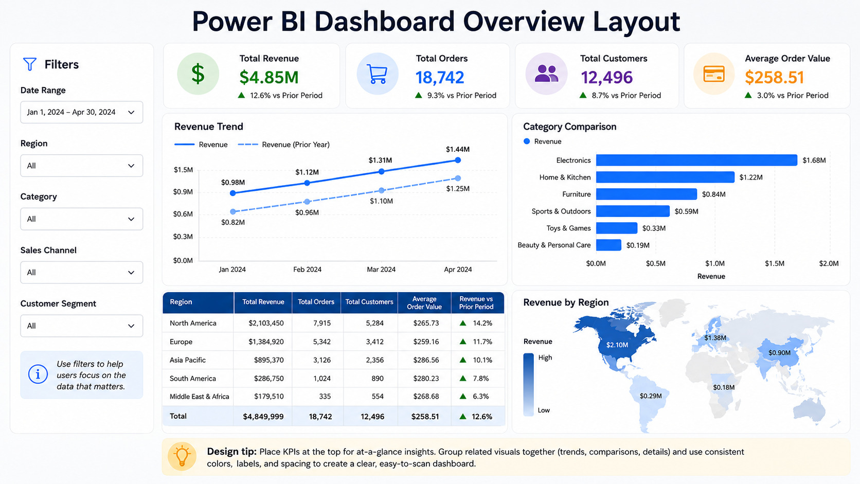
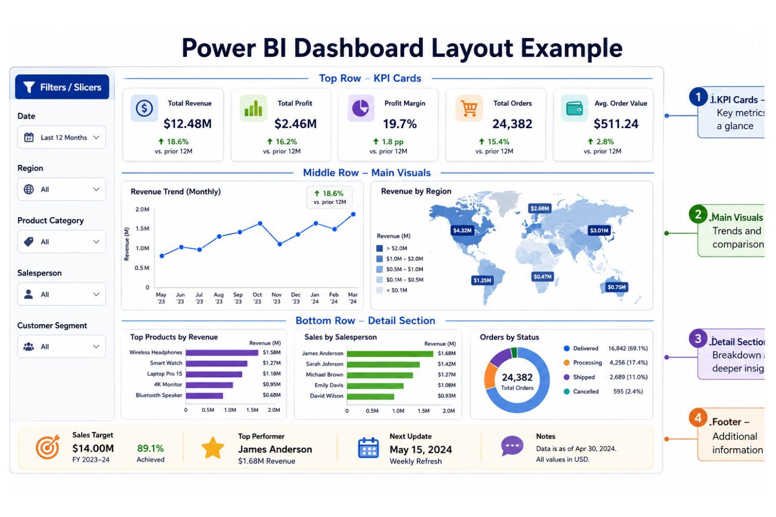
Step 7: Design the Dashboard Layout
Dashboard layout affects how quickly users understand the information. A good layout guides the eye from the most important metrics to supporting details. The top section should usually contain the headline KPIs, while the middle section can show trends and comparisons. The lower section can include detailed breakdowns, tables, maps, or supporting analysis.
Use consistent spacing, simple colors, readable labels, and clear section titles. Avoid placing too many slicers, charts, and tables on one page. If users need detailed exploration, the underlying report can provide that depth while the dashboard stays focused.
| Dashboard Area | Recommended Content |
|---|---|
| Top row | KPI cards |
| Middle left | Main trend chart |
| Middle right | Main comparison chart |
| Bottom section | Table, map, or detailed breakdown |
| Side or top | Filters and slicers |
| Footer | Refresh date and notes |
A professional layout builds confidence because users can quickly understand what they are seeing. For polished executive dashboards, Dashboard Development Services can help turn rough reports into clear, decision-ready dashboard systems.
Step 8: Add Interactivity
Interactivity helps users explore the dashboard without becoming overwhelmed. Power BI allows users to filter, drill down, drill through, hover for tooltips, navigate pages, and interact with visuals. These features are powerful when they are planned properly.
For example, a sales manager may want to filter the dashboard by region, product category, salesperson, and date range. A finance user may need to drill from yearly performance to monthly variance. An operations manager may need to click a delayed order category and view the affected branches or teams.
| Feature | Purpose |
|---|---|
| Slicers | Filter by region, product, date, or department |
| Drill-down | Move from year to quarter to month |
| Drill-through | Open a detailed page for a selected item |
| Tooltips | Show extra information on hover |
| Bookmarks | Save different views |
| Buttons | Improve navigation |
| Cross-filtering | Let one visual filter another |
| Page navigation | Create app-like movement |
Interactivity should help users answer questions faster. Do not add buttons, slicers, and drill pages just to make the dashboard look advanced. Every interaction should support a real user need.
Step 9: Publish the Report to Power BI Service
After creating the report in Power BI Desktop, publish it to Power BI Service. This allows users to access the report online, create dashboards, configure refresh, manage permissions, and share content through workspaces or apps. Publishing is an important step because dashboards are usually created in Power BI Service.
Save your Power BI file before publishing. Then sign in, select Publish, choose the correct workspace, and open the report in Power BI Service. After publishing, review the visuals, filters, data model behavior, and formatting because some items may need minor adjustments online.
A good publishing workflow should also consider ownership. Someone should know who maintains the dataset, who manages refresh failures, who approves KPI changes, and who controls user access. Without ownership, dashboards can become outdated or unreliable.
Step 10: Create a Dashboard in Power BI Service
Once the report is published, create the dashboard by pinning visuals. Open the report in Power BI Service, hover over a visual, select the pin icon, and choose whether to pin it to a new or existing dashboard. Repeat the process for the most important visuals, then arrange and resize the dashboard tiles. Microsoft’s dashboard creation guide describes this process as pinning visualizations from existing reports to a dashboard.
Do not pin every visual from the report. Choose only the visuals that support the dashboard’s main purpose. A dashboard should summarize performance, while the report can provide deeper analysis when users need to investigate details.
Power BI also allows users to pin an entire report page as a live tile. This can be useful when the whole report page has already been designed as a dashboard-style page, and Microsoft notes that live report page tiles can remain interactive on the dashboard.
After arranging the tiles, review the dashboard from the user’s perspective. Ask whether the most important KPIs are visible immediately, whether the layout is clear, and whether the dashboard answers the intended business question. If the dashboard feels crowded, remove lower-value tiles.
Step 11: Set Up Data Refresh
A dashboard is only valuable if users trust the data. If the dashboard does not refresh correctly, users may make decisions based on outdated information. That is why refresh planning should be part of the dashboard development process, not an afterthought.
Power BI refresh options depend on the data source. Excel files, cloud systems, SQL databases, on-premises systems, and live connections may require different configurations. Microsoft’s scheduled refresh guidance explains that refresh settings in Power BI Service include gateway connection, data source credentials, and schedule refresh.
| Refresh Area | What to Check |
|---|---|
| Data source credentials | Are login details valid? |
| Refresh schedule | Daily, weekly, hourly, or near-real-time |
| Gateway connection | Needed for some on-premises sources |
| Data volume | Large datasets may slow refresh |
| Failure alerts | Users should know if refresh fails |
| Ownership | Someone should monitor refresh reliability |
Refresh failures should be monitored and corrected quickly. A dashboard that fails silently can damage trust because users may continue reading old numbers without realizing the data is no longer current.
Step 12: Share the Dashboard Securely
Power BI dashboards often contain sensitive data, including revenue, profit, customer details, employee performance, operational results, and financial information. Sharing should therefore be controlled carefully. Not every user should see every dashboard, and not every user should have edit access.
Common sharing methods include direct dashboard sharing, workspace access, Power BI Apps, Microsoft Teams integration, and embedded reporting. Microsoft describes Power BI apps as a way to combine related content such as dashboards, reports, semantic models, and other items in one place for users.
Row-level security is important when different users should see different slices of the same dataset. Microsoft explains that RLS restricts data access for specific users through row-level filters defined within roles, and that in Power BI Service it applies to users with Viewer permissions.
For example, a regional manager may only see sales for their own region, while the executive team can see all regions. A department head may only see expenses for their department, while finance can view the entire budget. These controls protect sensitive information and improve trust in the reporting system.
Step 13: Test and Improve the Dashboard
Testing is one of the most important steps in dashboard development. A dashboard should not be shared widely until the KPIs, filters, visuals, refresh, permissions, and layout have been reviewed. Testing helps catch errors before users rely on the dashboard for decisions.
Compare KPI totals against trusted source data. Test slicers and filters to confirm they behave correctly. Ask a real user to review the dashboard and explain what they understand from it. If they cannot understand the main message quickly, the layout or labels may need improvement.
| Test Area | Question |
|---|---|
| KPI accuracy | Do totals match trusted source data? |
| Visual clarity | Can users understand the dashboard quickly? |
| Filters | Do slicers work correctly? |
| Refresh | Does scheduled refresh work? |
| Security | Can users only see approved data? |
| Performance | Does the dashboard load quickly? |
| Mobile view | Is the dashboard readable on phones? |
| Business value | Does it answer the original question? |
| User feedback | Have real users reviewed it? |
A dashboard should improve over time. After users start working with it, you may need to remove unused visuals, add missing KPIs, adjust labels, improve refresh, or simplify the layout.
How to Create a Dashboard in Power BI from Excel
Many businesses start with Excel because their data is already stored in spreadsheets. Power BI can work well with Excel data, but the spreadsheet must be structured correctly before import. If the Excel file contains merged cells, blank rows, inconsistent column names, manual subtotals, and repeated headers, Power BI may misread the data or produce unreliable results.
The best approach is to convert the Excel range into a clean table before importing it. Use one header row, consistent date formats, proper numeric columns, and clear field names. Keep raw data separate from summary sheets so Power BI can calculate totals correctly instead of reading already-summarized numbers.
| Excel Preparation Step | Why It Matters |
|---|---|
| Format data as a table | Helps Power BI detect fields correctly |
| Remove merged cells | Prevents import issues |
| Use one header row | Keeps column names clean |
| Remove blank rows | Avoids incomplete records |
| Avoid manual subtotals | Prevents double-counting |
| Use consistent dates | Supports trend analysis |
| Use clear column names | Makes fields easier to use |
| Keep raw data separate | Prevents reporting errors |
After the Excel file is ready, import it into Power BI Desktop, clean it in Power Query if needed, create measures, build visuals, publish to Power BI Service, and pin selected visuals to a dashboard. Businesses that still rely on manual spreadsheet reporting can benefit from Excel Dashboard and Reporting Services before moving into more advanced Power BI automation.
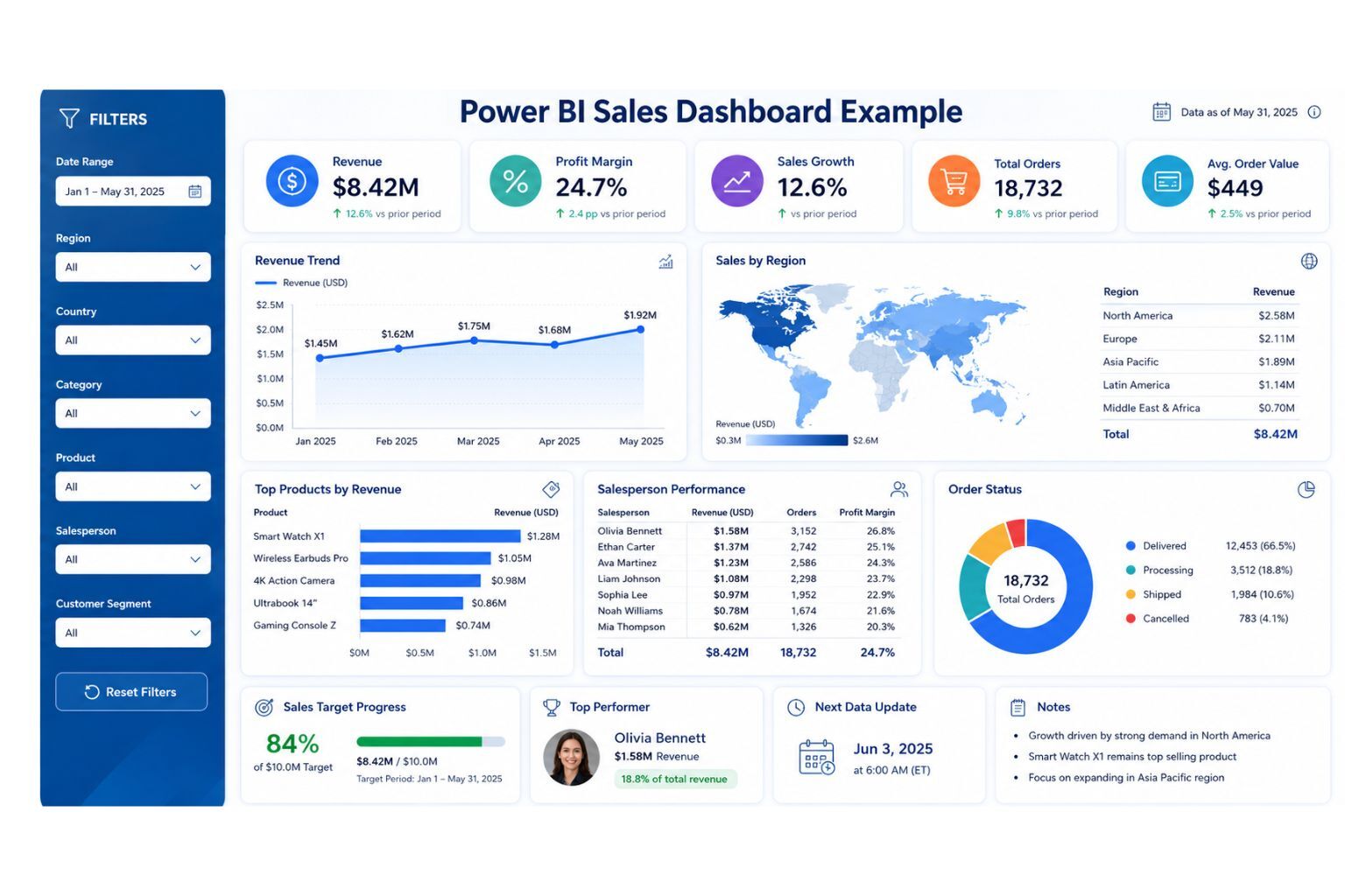
How to Create a Sales Dashboard in Power BI
A sales dashboard helps managers track revenue, profit, customers, products, salespeople, and regions. It should answer practical business questions such as whether revenue is growing, which products perform best, which salespeople are meeting targets, and where sales performance is weak.
A strong sales dashboard should not simply display every available sales field. It should focus on the most important KPIs and show them in a way that managers can understand quickly. For example, KPI cards can show total revenue, profit margin, sales growth, and average order value, while charts can show monthly trends, regional performance, top products, and salesperson performance.
| KPI | Purpose | Recommended Visual |
|---|---|---|
| Total revenue | Measures sales performance | KPI card |
| Profit margin | Tracks profitability | KPI card |
| Sales growth | Shows performance direction | KPI card, line chart |
| Average order value | Measures order quality | KPI card |
| Revenue by region | Compares sales territories | Map or bar chart |
| Top products | Shows best-selling items | Bar chart |
| Sales by salesperson | Tracks team performance | Bar chart |
| Customer segment revenue | Shows customer value | Stacked bar chart |
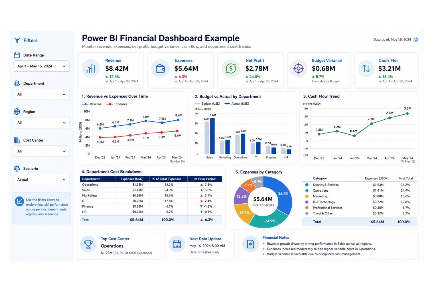
How to Create a Financial Dashboard in Power BI
A financial dashboard helps businesses monitor revenue, expenses, profit, budget performance, and cash flow. Unlike general dashboards, financial dashboards require extra care because users rely on them for sensitive business decisions. The calculations must be accurate, the data must be secure, and the layout must be easy to interpret.
Useful financial KPIs include revenue, expenses, net profit, profit margin, budget variance, department costs, and cash flow trends. A good financial dashboard should make it easy to compare actual results against targets or budgets. It should also help leaders identify where costs are increasing, where profit is declining, and where financial performance needs attention.
| KPI | Purpose | Recommended Visual |
|---|---|---|
| Revenue | Tracks income | KPI card |
| Expenses | Tracks cost | KPI card |
| Net profit | Shows financial performance | KPI card |
| Profit margin | Measures profitability | KPI card |
| Budget vs actual | Compares plan and performance | Bar chart |
| Cash flow trend | Monitors liquidity | Line chart |
| Department cost | Compares spending | Bar chart |
| Variance | Explains change | Waterfall chart |
How to Create a Live Dashboard in Power BI
A live dashboard is useful when business users need current or near-current data instead of waiting for manual report updates. However, “live” can mean different things depending on the data source, connection method, and refresh setup. Some dashboards update through scheduled refresh, while others use DirectQuery, streaming data, push datasets, or live connections.
Not every dashboard needs to be live. A monthly finance dashboard may only need scheduled refresh, while an operations, inventory, call center, or website monitoring dashboard may require faster updates. The best refresh method depends on how quickly users need to act on the information and how stable the underlying data source is.
| Live Dashboard Option | Best For | Key Consideration |
|---|---|---|
| Scheduled refresh | Daily or periodic business reporting | Easier to manage for many dashboards |
| DirectQuery | Querying source systems without importing all data | Can affect performance if poorly modeled |
| Streaming dataset | Real-time events and monitoring | Best for fast-changing operational data |
| Push dataset | Data pushed from apps or services | Requires technical setup |
| Live connection | Shared semantic models | Useful for governed enterprise reporting |
| Gateway refresh | On-premises data sources | Requires gateway setup and monitoring |
A strong live dashboard should also include refresh monitoring, ownership, performance testing, and clear user expectations. Users should know whether the data is real-time, hourly, daily, or manually refreshed. This prevents confusion and improves trust.
Power BI Dashboard Performance Optimization
Dashboard performance matters because slow reports reduce adoption. Users may stop using a dashboard if visuals take too long to load, filters respond slowly, or refresh fails often. Performance problems usually come from poor data modeling, too many visuals, heavy DAX calculations, large datasets, unnecessary columns, or inefficient relationships.
Start optimization by simplifying the data model. Remove unused columns, reduce high-cardinality fields where possible, use a clean star schema, and avoid unnecessary calculated columns when measures can do the job. Review DAX measures for complexity and test visuals that load slowly.
| Performance Issue | Possible Cause | Improvement |
|---|---|---|
| Slow visuals | Too many visuals or complex calculations | Reduce visuals and simplify measures |
| Slow refresh | Large data volume or weak queries | Filter unnecessary rows and optimize Power Query |
| Confusing filters | Too many slicers | Use fewer, more meaningful slicers |
| Large model size | Unused columns and tables | Remove unnecessary fields |
| Poor user experience | Overcrowded layout | Simplify the dashboard page |
| Slow DirectQuery | Source system or query performance | Use aggregation, model tuning, or import mode where suitable |
Performance optimization is part of professional Power BI Dashboard Services because a dashboard must be both useful and usable. A beautiful dashboard that loads slowly will not support daily decision-making.
Power BI Dashboard Governance and Maintenance
A dashboard should have an owner, a refresh process, KPI definitions, access rules, and a maintenance plan. Without governance, dashboards become outdated, duplicated, or inconsistent. Different departments may start using different definitions for revenue, profit, active customers, or conversion rate, which creates confusion during decision-making.
Governance does not need to be complicated. For a small business, it may be as simple as documenting KPI definitions, naming reports consistently, controlling who can edit dashboards, and reviewing data refresh weekly. For larger teams, governance may include workspace rules, semantic model ownership, app publishing, certified datasets, row-level security, and version control.
| Governance Area | What to Define |
|---|---|
| Dashboard owner | Who maintains the dashboard |
| KPI definitions | How each metric is calculated |
| Refresh responsibility | Who monitors refresh failures |
| Access control | Who can view, edit, or share |
| Change process | How dashboard updates are requested |
| Version control | How old and new reports are managed |
| Documentation | Where assumptions and definitions are stored |
| Review schedule | How often the dashboard is checked |
Good governance improves trust. It tells users that the dashboard is not just a one-time report, but a maintained business intelligence asset.
Common Mistakes to Avoid When Creating a Power BI Dashboard
Many Power BI dashboards fail because they try to do too much at once. The builder adds too many charts, too many slicers, too many KPIs, and too many colors. The result may look impressive at first, but users struggle to understand what matters.
Another common mistake is building visuals before validating the data. If the source data is messy, the data model is weak, or the KPI definitions are unclear, the dashboard will not be trustworthy. Users may eventually return to Excel because they do not believe the Power BI numbers.
| Mistake | Why It Hurts | Better Approach |
|---|---|---|
| Starting with visuals | Creates unfocused dashboards | Start with business questions |
| Too many KPIs | Overwhelms users | Use fewer, decision-focused KPIs |
| Messy data | Produces wrong numbers | Clean data before visualizing |
| Weak model | Causes errors and slow reports | Build a clear data model |
| Poor chart choice | Misleads users | Match visuals to questions |
| No refresh plan | Shows outdated data | Configure and monitor refresh |
| No security review | Exposes sensitive data | Use proper access control |
| No user testing | Dashboard may not fit real needs | Test with actual users |
| No documentation | Creates confusion later | Document KPIs and assumptions |
Avoiding these mistakes helps the dashboard become a reliable decision tool instead of a decorative report.
Power BI Dashboard Pricing
Power BI dashboard pricing depends on the quality of the data, number of data sources, dashboard complexity, refresh needs, security requirements, number of users, and level of automation required. A simple dashboard from one clean Excel file costs less than a multi-source business intelligence system with advanced DAX, scheduled refresh, row-level security, and documentation.
Pricing should be transparent enough to build trust, but flexible enough to reflect the real scope of work. A fixed price before reviewing the data can be misleading because two dashboards may look similar on the surface but require very different levels of data preparation and modeling.
| Package | Best For | Includes | Pricing Positioning |
|---|---|---|---|
| Starter Dashboard | Small businesses and simple Excel reporting | 1 data source, basic cleaning, 1 dashboard, core KPIs | Entry-level quote |
| Professional Dashboard | Growing teams and departments | Data cleaning, DAX measures, report design, dashboard setup, refresh guidance | Custom project quote |
| Advanced BI System | Multi-source business reporting | Multiple data sources, data model, advanced DAX, security, scheduled refresh, documentation | Consultation-based quote |
| Dashboard Optimization | Existing Power BI users | KPI correction, design cleanup, refresh troubleshooting, speed improvement | Audit plus implementation |
| Monthly BI Support | Ongoing reporting needs | Dashboard updates, new KPIs, refresh monitoring, stakeholder support | Monthly retainer |
This pricing section also helps conversion because visitors often want to know whether the service fits their budget. It positions DataScienceConsultingPro.com as practical, transparent, and business-focused without locking every client into the same price.
Need a Power BI dashboard quote? Contact DataScienceConsultingPro.com with your data source, dashboard goals, and reporting needs, and we will recommend the best package for your project.
Our Power BI Dashboard Development Process
A professional Power BI dashboard project should follow a structured process. This reduces errors, improves communication, and helps users trust the final dashboard. The process should include discovery, data review, cleaning, modeling, dashboard design, testing, publishing, and support.
At DataScienceConsultingPro.com, the goal is to build dashboards that are useful for real business decisions, not just visually attractive. Each stage focuses on accuracy, usability, performance, and long-term maintenance.
| Stage | What Happens | Outcome |
|---|---|---|
| Discovery | Understand goals, users, KPIs, and decisions | Clear dashboard scope |
| Data review | Review Excel files, databases, or systems | Data quality assessment |
| Data cleaning | Prepare fields, formats, and tables | Reliable dataset |
| Modeling | Create relationships and measures | Accurate reporting model |
| Dashboard design | Build visuals, layout, and filters | Clear user experience |
| Testing | Validate KPIs, filters, refresh, and access | Trusted dashboard |
| Publishing | Publish to Power BI Service | Shareable reporting asset |
| Support | Update KPIs, fix issues, and improve reports | Long-term value |
This process helps avoid rushed dashboard builds that look complete but fail during real use.
Mini Case Example: From Manual Excel Reports to Power BI Dashboard
Imagine a growing retail business that tracks sales in Excel, expenses in accounting software, and product categories in a separate spreadsheet. Every week, a manager manually copies data into a reporting file, updates charts, checks totals, and emails screenshots to the leadership team. The process takes hours, and the numbers are sometimes questioned because different versions of the spreadsheet exist.
A Power BI dashboard can solve this by connecting the data sources, cleaning the files, creating consistent KPIs, and publishing a dashboard that refreshes on schedule. The sales team can monitor revenue, top products, sales by region, and average order value. The finance team can compare revenue, expenses, profit, and budget variance. Leadership can view a clean executive dashboard without waiting for manual updates.
This type of transformation improves trust, saves time, and gives decision-makers a single version of the truth. It is also why businesses often move from spreadsheet reporting to professional Dashboard Development Services when reporting becomes too manual or inconsistent.
When Should You Hire a Power BI Dashboard Consultant?
You can create a simple Power BI dashboard yourself if your data is clean, your KPIs are basic, and you have enough time to learn the platform. However, many business dashboards become difficult when the data comes from several sources, the KPIs require custom calculations, or users need secure access and automated refresh.
A consultant can help when your Excel reports take too long to update, managers do not trust the current numbers, the dashboard loads slowly, or your team needs a stakeholder-ready reporting system. A consultant can also help design the data model, validate KPI calculations, improve layout, automate refresh, and document assumptions.
DataScienceConsultingPro.com helps businesses design Power BI dashboards, clean datasets, build automated reporting systems, create KPI dashboards, and turn raw data into decision-ready insights. Explore Power BI Dashboard Services or Data Analysis Services if you need a dashboard that is accurate, professional, and useful.
Why Choose DataScienceConsultingPro.com?
A Power BI dashboard should not only look attractive. It should be accurate, secure, fast, scalable, and useful for business decisions. That means the work must include business planning, data cleaning, KPI definition, visual design, refresh planning, security review, and user testing.
DataScienceConsultingPro.com focuses on dashboards that help teams act on data. The goal is not to create decorative charts, but to build reporting systems that reduce manual work, improve visibility, and help managers understand performance clearly.
| Trust Factor | What It Means for You |
|---|---|
| Business-first planning | The dashboard is built around real decisions |
| Data cleaning support | Messy data is corrected before reporting |
| KPI accuracy | Measures are validated against business definitions |
| Professional design | Dashboards are clear and stakeholder-ready |
| Automation focus | Manual reporting work is reduced |
| Refresh planning | Dashboards stay updated |
| Security awareness | Access can be controlled properly |
| Documentation | KPI definitions and assumptions are clear |
| Scalable structure | Dashboards can grow with the business |
A strong dashboard increases trust in your data. It gives managers and teams one reliable place to understand performance.
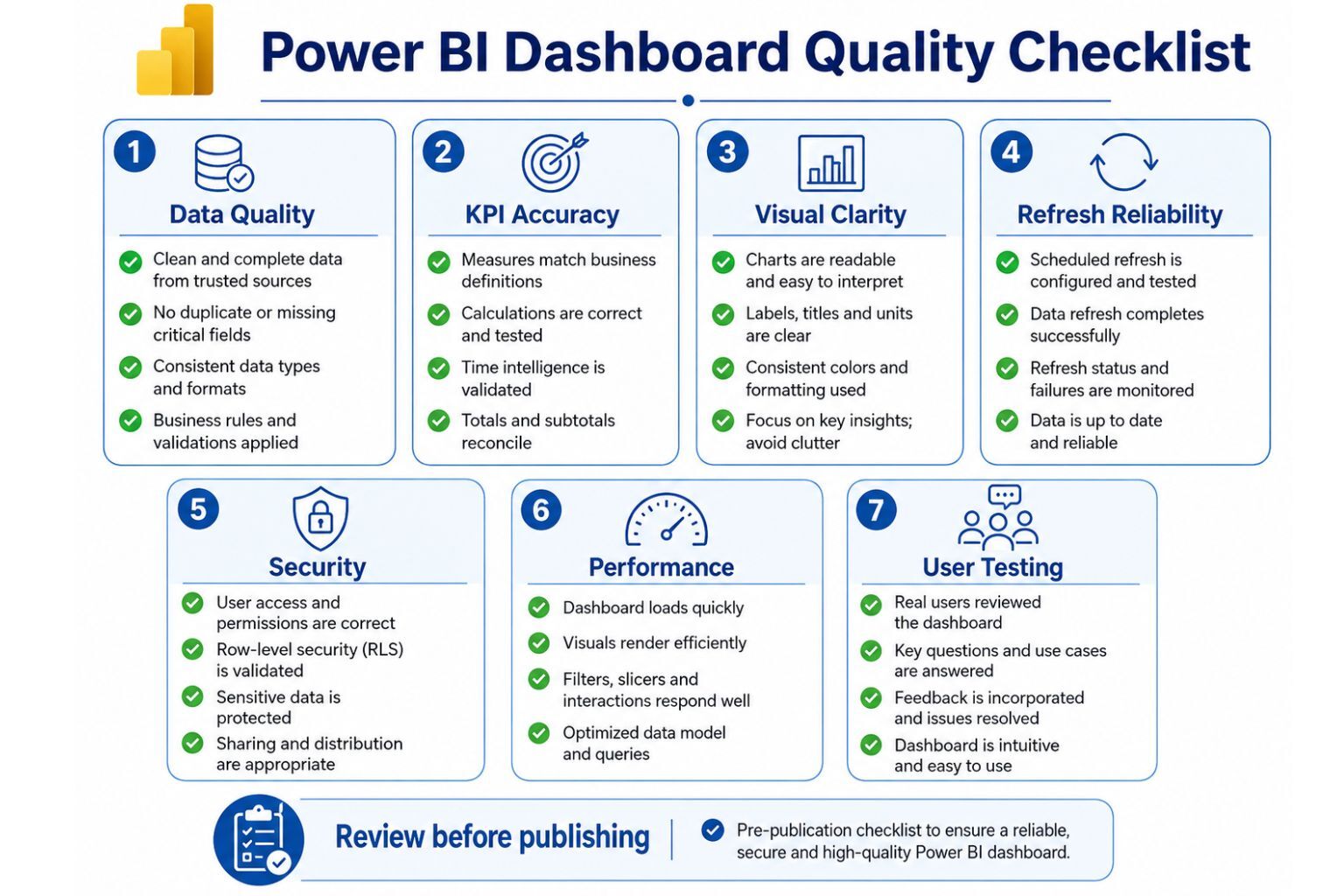
Power BI Dashboard Checklist
Use this checklist before publishing your dashboard. It helps ensure the dashboard is accurate, readable, secure, and ready for real users.
| Category | Checklist |
|---|---|
| Data readiness | Data is clean, complete, and correctly formatted |
| Data model | Relationships are correct |
| KPIs | Measures match business definitions |
| Visuals | Charts are easy to understand |
| Layout | Important metrics appear first |
| Interactivity | Filters and drill features work |
| Refresh | Scheduled refresh is configured |
| Security | Users have correct access |
| Performance | Dashboard loads quickly |
| Mobile | Mobile layout is readable |
| Documentation | KPI definitions are clear |
| User testing | Real users have reviewed it |
FAQs About Creating a Dashboard in Power BI
To create a dashboard in Power BI, first build a report in Power BI Desktop or Power BI Service. Import your data, clean it, create relationships, build measures, and design visuals. Then publish the report to Power BI Service. In Power BI Service, open the report, pin selected visuals to a new or existing dashboard, arrange the tiles, configure refresh, test the dashboard, and share it with approved users.
You can create reports in Power BI Desktop, but true Power BI dashboards are created in Power BI Service. Power BI Desktop is mainly used for data import, Power Query cleaning, data modeling, DAX measures, and report design. After publishing the report to Power BI Service, you can pin report visuals to a dashboard.
A Power BI report is usually a detailed, interactive analysis file with one or more pages. A dashboard is usually a single-page summary made from pinned visuals. Reports help users explore data, while dashboards help users monitor key metrics quickly.
Yes. You can create a Power BI dashboard from Excel data. The Excel file should be formatted as a clean table with clear headers, consistent dates, no merged cells, and no manual subtotal rows. Import the Excel file into Power BI Desktop, clean it with Power Query, create visuals, publish the report, and pin visuals to a dashboard.
You can make the underlying report interactive with slicers, filters, drill-down, drill-through, tooltips, bookmarks, buttons, page navigation, and cross-filtering. Dashboard tiles can also link back to the underlying report, allowing users to explore the data in more detail.
To create a live dashboard in Power BI, choose the refresh method that fits your data and decision needs. Options include scheduled refresh, DirectQuery, streaming datasets, push datasets, live connections, and gateway refresh for on-premises sources. The best choice depends on how often the data changes and how quickly users need to act.
A simple dashboard from clean Excel data may take a few hours or a few days. A professional dashboard with multiple data sources, DAX measures, scheduled refresh, security, and stakeholder-ready design may take several days or weeks. The timeline depends on data quality, reporting complexity, and user requirements.
You do not need advanced DAX for a basic dashboard, but DAX is important for custom KPIs such as profit margin, growth rate, budget variance, year-to-date revenue, moving averages, and average order value. Basic DAX improves accuracy and flexibility.
A good Power BI dashboard is clear, accurate, fast, focused, and useful. It answers important business questions, uses clean data, shows relevant KPIs, refreshes reliably, and gives users enough context to make decisions.
Power BI dashboard cost depends on data quality, number of data sources, dashboard complexity, refresh needs, security requirements, user access, and support needs. A simple Excel-based dashboard is usually less expensive than a multi-source dashboard system with advanced modeling, DAX, scheduled refresh, governance, and documentation.
You should consider hiring a Power BI dashboard consultant if your data comes from multiple systems, your Excel reports take too long, your team does not trust current reports, or you need automated reporting with secure sharing. A consultant can help you build a dashboard that is accurate, fast, professional, and easier to maintain.
Conclusion
Learning how to create a dashboard in Power BI is not only about adding charts to a report. A strong dashboard starts with a clear business purpose, clean data, accurate KPIs, a reliable model, thoughtful layout, secure sharing, and a refresh plan. When these elements work together, the dashboard becomes a trusted tool for decision-making.
The best Power BI dashboards help users understand what is happening, where performance is changing, and what needs attention. They reduce manual reporting, improve visibility, and give teams one reliable place to monitor performance. A dashboard should be simple enough to understand quickly but strong enough to support serious business decisions.
If your business needs a Power BI dashboard, automated reporting system, Excel-to-Power BI migration, KPI dashboard, or business intelligence support, DataScienceConsultingPro.com can help you build dashboards that are accurate, clear, secure, and designed for real decisions. Contact us today to discuss your Power BI dashboard project, pricing, timeline, and reporting goals.