
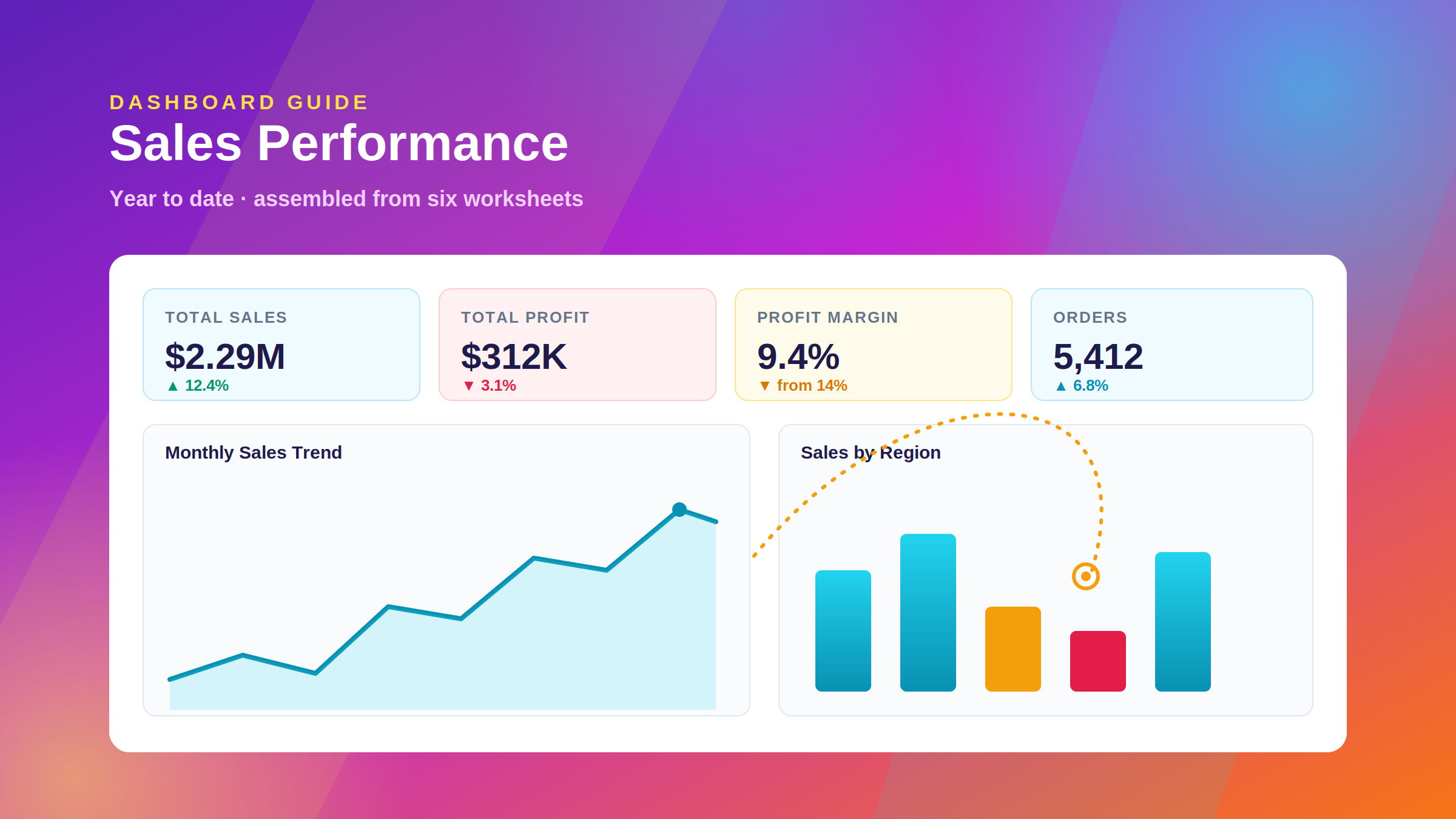
By Pius Imwene, Data Analyst and Analytics Consultant at DataScienceConsultingPro.com. Published 22 August 2026.
Most people arrive at Tableau with a folder of spreadsheets and a request from a manager who wants “a dashboard.” Closing the gap between those two things is what this guide is for.
To create a dashboard in Tableau, you connect and verify your data source, decide which KPIs the dashboard needs to answer, build each chart as a separate worksheet, click the New Dashboard icon at the bottom of the workbook, drag those worksheets onto the canvas, arrange them into a clear hierarchy, add filters and dashboard actions, format and size the result, validate every number, then publish to Tableau Public, Tableau Cloud, or Tableau Server.
This guide covers how to create a dashboard in Tableau one stage at a time. It uses a single sales dataset from start to finish, so you end up with a working dashboard rather than a tour of the interface.
One point before the steps. In Tableau, a dashboard is assembled from parts you build separately. Every chart is created as its own worksheet, and the dashboard is the canvas that brings those worksheets together and wires them to each other. Most of Tableau makes more sense once that model is clear.
What Is a Tableau Dashboard?
A Tableau dashboard is a single canvas that displays several worksheets at once, along with supporting objects such as filters, legends, and text. It lets a reader understand a situation without opening five separate views.
A worksheet holds exactly one visualization. A dashboard holds many, and lets them interact, so clicking a region can filter the trend line beside it. A story is a third object that strings views into a narrated sequence, closer to a slide deck than a control panel.
| Tableau Component | Purpose | Typical Use | Interactive? |
|---|---|---|---|
| Worksheet | One visualization | Monthly sales trend line | Filters and tooltips only |
| Dashboard | Multiple related views on one canvas | Executive sales dashboard | Yes: filters, actions, highlighting |
| Story | An ordered sequence of views | Presenting a quarterly analysis | Sequential navigation |
Because the dashboard only displays what the worksheets contain, the quality of each individual view sets the ceiling for the whole thing. Getting those views right accounts for most of the work.
What You Need Before You Start
A Tableau Environment
Three environments will build a dashboard, and the difference between them matters most when you come to share it.
Tableau Desktop is the paid authoring application. It connects to the widest range of sources, including live SQL databases and cloud warehouses, and it is what most business analysts use day to day.
Tableau Desktop Public Edition is free and capable enough for learning, with one significant catch: it saves only to Tableau Public. According to Tableau’s own FAQ, it supports extracted data only, accepts sources such as Excel, text files, statistical files, Google Drive and OData, and caps a workbook at 15 million rows.
Tableau Public web authoring runs in the browser with no install. It suits practice and portfolio work.
Every step below works in all three. Differences are flagged where they matter.
Data You Can Trust
Dashboard quality is capped by data quality, and formatting never rescues a wrong number. Before you connect anything, check that dates are stored as dates, that numeric fields have not been contaminated by currency symbols or thousands separators, that categories are spelled consistently, and that duplicate rows are gone. Tableau treats East, east, and EAST as three separate regions.
This is the most common reason a first dashboard has to be rebuilt. If your data is messy or spread across several systems, sort that out before you open Tableau. It is the problem our data cleaning services are built around.
Defined Business Questions
Read Step 2 before you start building. It is the step that decides whether people use the finished dashboard or quietly ignore it.
The Tutorial Dataset
Everything below uses one order-level sales dataset with the same shape as Tableau’s bundled Sample – Superstore file, so you can follow along with data already on your machine:
Order Date · Region · Category · Product Name · Customer Name · Sales · Profit · Quantity
One row is one product line on one order. If you are using your own data, map your fields to these eight and every step still applies.
How to Create a Dashboard in Tableau
Here is the full process in short form. Each step is expanded below.
- Connect your data and verify field types on the Data Source page.
- Define the KPIs and business questions the dashboard must answer.
- Build your first worksheet, the monthly sales trend.
- Build the remaining worksheets, one visualization each.
- Create a new dashboard using the New Dashboard icon.
- Drag the worksheets onto the dashboard canvas.
- Organize the layout with containers, padding, and hierarchy.
- Add filters and scope them across the relevant worksheets.
- Add dashboard actions to make the views interactive.
- Add a descriptive title, labels, and source context.
- Format the dashboard for readable, professional output.
- Set the dashboard size and add device layouts.
- Test every KPI, filter, and action against the source data.
- Publish or share the dashboard.
Step 1: Connect Your Data to Tableau
Pick a connector from the Connect pane. Under To a File you will find Excel, Text file (CSV), JSON, PDF, and statistical files. Under To a Server you will find SQL Server, MySQL, PostgreSQL, Snowflake, BigQuery, Redshift, and dozens more. Tableau then opens the Data Source page, which is your last checkpoint before mistakes turn into charts.
Check four things while you are there.
Data types. The small icon above each column header shows a calendar for dates, # for numbers, Abc for text, and a globe for geographic fields. If Order Date shows Abc, fix it here. A date stored as text cannot be aggregated by month.
Joins or relationships. Tableau’s default relationship model keeps tables at their own level of detail, which avoids the duplicated-row problem a careless inner join creates. Drop to a physical join only when you specifically need one.
Missing values. Scan the preview grid. Nulls in Region will show up as their own bar on every chart you build.
Live or Extract. Live queries the source each time. Extract creates a fast local snapshot. For a first dashboard on a file source, Extract is the safer default.
Rename cryptic fields to business language while you are here, so cust_nm_1 becomes Customer Name. It takes thirty seconds and every future viewer benefits.
A dashboard inherits every flaw in its source. When a join fans out order lines, Sales is inflated on every view at once, and because all the charts agree with each other the error looks like truth. Catching that at the Data Source page is far cheaper than debugging eight charts later.
Step 2: Identify the KPIs and Questions Your Dashboard Should Answer
Write down what the dashboard is for before you drag a single field onto a shelf. Fifteen minutes here routinely saves a day of rework.
Frame it as questions a specific person asks. For a sales manager, the list usually looks like this:
- What are our total sales and profit for the period?
- Are sales growing or shrinking month over month?
- Which regions generate the most revenue, and which are quietly losing money?
- Which categories and products perform best?
The KPIs then follow almost mechanically: Total Sales, Total Profit, Profit Margin (Profit ÷ Sales), and Number of Orders. Four numbers, not twelve.
Two things worth knowing from building these for clients.
Starting from questions keeps the dashboard clean. When you start from charts instead, every field in the dataset looks like it deserves a view, and you end up with a wall of visuals nobody reads.
Different audiences need different dashboards rather than one bigger dashboard. A senior decision-maker wants four numbers and one trend, readable in ten seconds. An analyst wants granularity and the ability to drill into an anomaly. A single canvas trying to do both usually does neither well. Build the executive view, then link a detailed view behind it with a Go to Sheet action.
Working out which metrics actually explain performance, rather than just describe it, is the substance of our data analysis services.
Step 3: Create the First Tableau Worksheet
Open Sheet 1. Four areas do most of the work:
- Columns and Rows shelves control the horizontal and vertical axes.
- The Marks card controls mark type, plus Color, Size, Label, Detail, and Tooltip.
- The Data pane lists dimensions above and measures below.
- Show Me suggests valid chart types. It is useful while you learn the tool, but do not let it make design decisions.
Now build the monthly sales trend:
- Drag Order Date to the Columns shelf. Tableau defaults to
YEAR(Order Date). - Click the pill’s drop-down and choose Month from the second, continuous (green) date group. This gives you a real timeline across years instead of months stacked on top of each other. The distinction between discrete blue date parts and continuous green date values catches out almost every beginner.
- Drag Sales to the Rows shelf. Tableau aggregates it to
SUM(Sales). - Set the mark type to Line.
- Right-click the axis, choose Format, and set currency with no decimals.
$1.2Mreads faster than1218342.19. - Double-click the sheet tab and rename it Monthly Sales Trend.
Renaming matters more than it looks. Worksheet names appear in the dashboard’s Sheets list and, by default, as the title above each view, so Sheet 4 will follow the dashboard everywhere it goes.
A line chart suits this question because the question is about change over time, and connected lines let readers follow a slope instead of comparing bar heights.
Step 4: Create Additional Worksheets
Five more views, each answering one question from Step 2.
Total Sales (KPI). Drag Sales to Text on the Marks card. That is the whole build. Format as currency, hide the title, and increase the font size. This big-number pattern is the backbone of a Tableau KPI dashboard.
Total Profit (KPI). Same pattern. Drag Profit to Color with a diverging palette centered on zero so losses appear red.
Profit Margin (KPI). Right-click in the Data pane, choose Create Calculated Field, name it Profit Margin, and enter:
SUM([Profit]) / SUM([Sales])
Write it as a ratio of sums rather than AVG([Profit]/[Sales]). Averaging row-level ratios gives a $6 order the same weight as a $60,000 order, and the resulting margin will match nothing.
Sales by Region. Region to Rows, Sales to Columns, mark type Bar, sorted descending. Drop Profit onto Color and any high-revenue, low-profit region becomes obvious at a glance. A map works here too, but a sorted bar chart answers “which region sells the most” faster, because the ranking is stated rather than inferred from shading.
Sales by Category. Same pattern. With three or four categories, use bars rather than a pie chart. Sorted lengths are easier to compare than wedges.
Top 10 Products. Product Name to Rows, Sales to Columns. Then right-click the Product Name pill, choose Filter, open the Top tab, and set Top 10 by Sum of Sales. Without that filter you get several thousand bars, which is a scrollbar rather than a visualization.
| Business Question | Recommended Visualization | Why It Works |
|---|---|---|
| How are sales changing over time? | Line chart | Slope shows direction and rate at a glance |
| Which region sells the most? | Sorted bar chart, or a map if spatial pattern matters | Ranking is explicit |
| Which categories perform best? | Ranked horizontal bar chart | Easy length comparison, room for long labels |
| What is our headline performance? | Big-number KPI text mark | Requires no decoding |
| Where does profit come from? | Bar with profit on Color, or a sales-vs-profit scatter | Surfaces high-revenue, low-margin cases |
| Are we hitting target? | Bullet graph | Actual, target, and threshold in one mark |
Each of these takes under two minutes once you know the pattern. The judgment sits in choosing the chart, not in building it.
Step 5: Create a New Dashboard in Tableau
Click the New Dashboard icon at the bottom of the workbook, just to the right of your sheet tabs. The Data pane is replaced by the Dashboard pane, which has three sections you will use:
- Size offers Fixed size, Automatic, or Range. Step 12 covers these.
- Sheets lists every worksheet in the workbook, ready to drag.
- Objects holds Horizontal container, Vertical container, Text, Image, Web Page, Blank, Navigation, Download, and Extension.
At the bottom are two toggles that shape everything after this point: Tiled and Floating. A tiled object snaps into a grid, cannot overlap anything, and resizes when its neighbors change. A floating object sits in a free layer at coordinates you set and can overlap other objects.
Use tiled for almost everything while you are starting out. Floating gives you pixel control, and experienced designers use it for finishing touches such as a logo in a corner or a filter panel over a map. The catch is that floating objects do not reflow when the dashboard resizes, so a floating-heavy layout that looks perfect on your monitor can end up overlapping on someone else’s screen.
Tick Show dashboard title now so you do not forget it later.
Step 6: Add Worksheets to the Dashboard
Drag worksheets from the Sheets list onto the canvas. Tableau shows a gray preview of where the sheet will land, and it is worth watching, because it tells you which container you are dropping into.
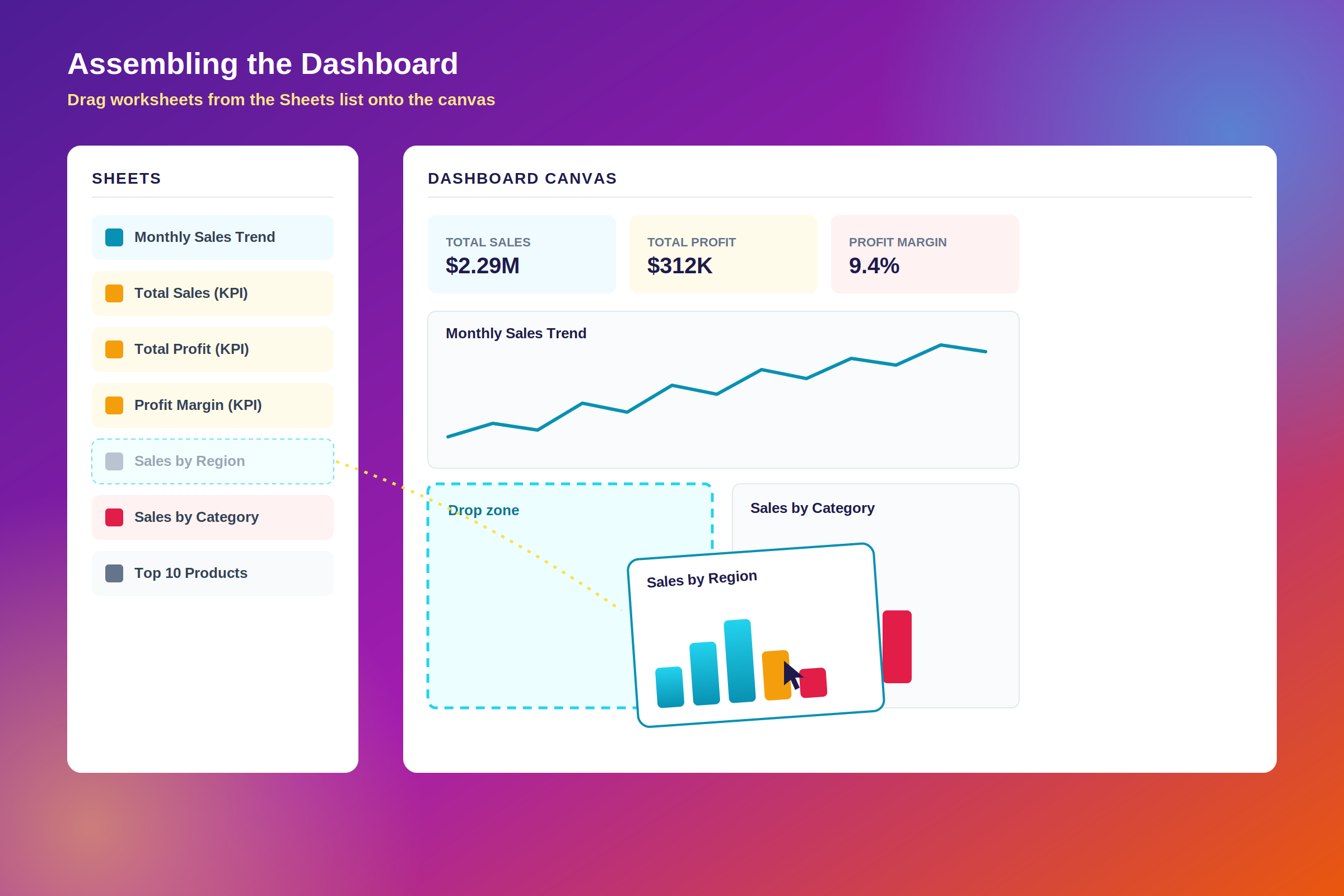
Build in reading order:
- Place the four KPI sheets across the top. Drop each one against the right edge of the previous so they form a single row, roughly 100 to 120 pixels tall.
- Put Monthly Sales Trend directly beneath, spanning the full width. This view answers “how are we doing,” so give it the most space.
- Add Sales by Region below that, then drop Sales by Category to its right so they share a row.
- Place Top 10 Products beside or beneath them, depending on the vertical room left.
- Resize by dragging the borders between objects. To resize a whole container rather than a single sheet, select the object and use the container grip at the top of its border.
The resulting arrangement puts KPIs on top, the trend in the middle, and breakdowns at the bottom. Tableau’s design guidance notes that viewers scan starting from the top left, which makes the upper-left corner the most valuable space on the canvas.
Most of the effort in this step is spatial rather than analytical, which is as it should be. The analysis is already finished, and you are now deciding what a reader sees first.
Step 7: Organize the Dashboard Layout
Open the Layout tab with an object selected. This is where a dashboard stops looking homemade.
Containers. A Horizontal container arranges objects left to right and distributes width between them. A Vertical container arranges them top to bottom and distributes height. Drag containers in before you add sheets and the layout becomes predictable instead of something you fight. A clean structure for this dashboard is one outer vertical container holding three horizontal containers: KPIs, trend, breakdowns. Select a container and use Distribute Evenly from its drop-down to give its children equal space, which fixes most “why are my KPI cards different widths” problems.
Padding. With an object selected, the Layout tab exposes Outer Padding, the space outside the object’s border, and Inner Padding, the space between the border and the content. Setting a consistent 8px outer padding on every object produces even gutters and is the quickest route to a designed look.
Item hierarchy. Also on the Layout tab, this tree shows how every object is nested. When you cannot click the thing you want to select, which happens to everyone, select it here instead.
White space. Empty space creates the groupings that let a reader parse the dashboard without effort. A canvas with something in every pixel pushes that work onto the reader.
On the question of how many views to include, Tableau’s official guidance recommends limiting a dashboard to two or three views. That is stricter than most working dashboards manage, and the reasoning behind it is more useful than the number. KPI text marks are cheap for a reader to process, so four of them do not cost what four more charts would. What holds is the underlying point: every chart you add competes for attention with the ones already there. This example has four KPI tiles and four charts, which is at the upper limit. If you find yourself wanting a ninth view, build a second dashboard and link to it.
Step 8: Add Filters to the Tableau Dashboard
Filters turn a static report into something a manager can interrogate. The mechanics take a minute; knowing when to stop adding them takes longer.
To add one, right-click the field on any worksheet, say Region, and choose Show Filter. The filter card then appears on any dashboard containing that sheet. If it does not, select the worksheet on the dashboard, click the drop-down on its border, and choose Filters.
Scope is the step people miss. By default a filter applies only to the worksheet it was created on, which is why beginners so often report that their filter “only changes one chart.” Click the card’s drop-down and choose Apply to Worksheets:
| Apply to Worksheets Option | What It Does | When to Use It |
|---|---|---|
| Only This Worksheet | Current sheet alone. This is the default. | Rarely. Mainly chart-specific constraints such as Top 10 |
| Selected Worksheets | Opens a picker; on a dashboard you can click All on dashboard | The safest choice for dashboard-wide filters |
| All Using This Data Source | Every sheet on that primary data source, across the workbook | Single-source workbooks where the filter is genuinely global |
| All Using Related Data Sources | Extends to related sources as well | Multi-source workbooks with defined relationships |
Three filters are enough for this dashboard: Order Date as a range slider, Region and Category as multi-select dropdowns, each set to Selected Worksheets → All on dashboard.
Each card’s drop-down also controls how it behaves. Use Single Value (dropdown) when only one selection makes sense, Multiple Values (list) with checkboxes for a handful of options, and Range of Dates for a slider.
Every filter you add hands a decision to the reader, and decisions cost attention. Three or four filters on a business dashboard is comfortable. Eight is a form. Two patterns are worth watching for. The first is a filter that a sensible default would replace: if 95% of use is the current quarter, default to it rather than making everyone set it. The second is a filter on a field nobody actually segments by, which usually exists because the field happened to be available. Also switch on Only Relevant Values for dependent filters, or selecting the West region will still show Eastern cities in the city filter, and readers will report it as a bug.
Step 9: Make the Dashboard Interactive
Dashboard actions let a click in one view change what the others show. The quickest version needs no setup at all: hover over a worksheet and click the funnel icon, Use as Filter, in its corner.
For real control, go to Dashboard → Actions → Add Action. Tableau offers six types:
- Filter uses marks selected in one view to filter another. This is the one you will use most.
- Highlight dims everything except the selected marks. Nothing is removed, so totals stay intact.
- Go to URL opens an external page or file, optionally passing field values into the URL.
- Go to Sheet navigates to another worksheet, dashboard, or story in the workbook, which is how you build drill-down from a summary to a detail view.
- Change Parameter lets a click on a mark set a parameter value.
- Change Set Values lets a click change the members of a set, which suits comparison analysis.
Each action runs on Hover, Select (click), or Menu. Use Select for filter actions and keep Hover for highlighting, because a hover-triggered filter rewrites the whole dashboard every time the mouse crosses a mark.
Here is one worth building. Name it Region Drill. Source sheet: Sales by Region. Run action on: Select. Target sheets: Monthly Sales Trend, Sales by Category, and Top 10 Products. Clearing the selection: Show all values. Clicking West now rewrites the trend, the category mix, and the product ranking for that region, and clicking empty space brings everything back. That single action answers “why did sales drop in March” in about four clicks.
Always set clearing to Show all values. The other two options leave users stuck in a filtered state they cannot escape, which is the most common way an otherwise good dashboard becomes frustrating.
Add an interaction because it answers a question a real person asks. Interactivity that nobody discovers does no work, and every extra behavior is one more thing a reader has to find.
Need a Tableau Dashboard Built Around Your Actual Business Data?
Following a tutorial with sample data is one thing. Building a reliable dashboard on top of a real CRM export, three regional spreadsheets, and a production database is another. DataScienceConsultingPro.com helps organizations consolidate and clean their data, define KPIs that reflect how the business actually runs, design dashboards people use, and automate the reporting behind them. Take a look at our dashboard development services, or discuss your dashboard project with us directly.
Step 10: Add Titles, Text, and Context
People read a dashboard without having been in the room when it was built, so context has to travel with it.
Dashboard title. Say what it is and what period it covers. Sales Performance Dashboard — 2026 Year to Date answers the first question every dashboard gets asked. Dashboard 1 does not.
KPI labels. $2.29M on its own means nothing. Each tile needs a label, such as Total Sales, Total Profit, Profit Margin, or Orders, and ideally a prior-period comparison. Readers cannot judge a number as good or bad without a reference point.
Source and freshness. Drag a Text object into the footer with something like Source: Sales database · Data through 31 July 2026 · Refreshed daily 06:00. One line prevents a great deal of confusion and signals that someone is maintaining the thing.
Legends belong only where color or size encodes something that is not obvious from the axis.
Tooltips are worth rewriting through Worksheet → Tooltip. Something like <Region> generated <SUM(Sales)> across <CNTD(Order ID)> orders turns a hover into a sentence.
Step 11: Format the Dashboard Professionally
Fonts. One family throughout, varying size and weight rather than typeface. Apply brand fonts through Format → Workbook so they land everywhere at once.
Numbers. Right-click each measure, then Format → Numbers. Use currency for money, no decimals on large values, thousands separators throughout, and one decimal place on percentages. Keep units consistent, because 2,285,000 sitting next to $2.29M reads as a mistake even when both are correct.
Chart titles. Give every view a descriptive title, or hide them all and rely on the layout. A mix of the two looks unfinished. Right-click a title and choose Hide Title to remove one.
Gridlines and borders. Lighten or remove gridlines through Format → Lines. Use borders to separate logical groups rather than individual charts.
Backgrounds. White or a very light neutral. Dark dashboards can work, but every color needs retuning and they print badly.
Color. Pick one accent color for your primary measure and use gray for everything supporting it. Color should carry specific meaning, such as profit against loss or above against below target. When every chart is multicolored, color stops carrying information.
Accessibility. Roughly one in twelve men has some form of color vision deficiency, so color should never be the only thing carrying meaning. Pair a red or green profit indicator with a + or − sign, or with an arrow. Tableau ships a Color Blind palette; making it your default categorical palette handles most of this for free. Keep text contrast strong and body labels at 9pt or larger.
Step 12: Optimize the Dashboard for Different Screen Sizes
The Size section of the Dashboard pane offers three behaviors.
Fixed size, the default, keeps the dashboard at the same dimensions regardless of the window. It is predictable, it caches well on the server, and it is required if you use floating objects. Presets include Desktop Browser (1000 × 800) and Laptop Browser (1366 × 768).
Automatic resizes the dashboard to fill the window. It works with fully tiled layouts, though Tableau’s documentation is candid that results can be unpredictable across very different screens.
Range scales between a minimum and maximum you specify, which is the best compromise for most business dashboards.
Device layouts handle the harder problem. Eight views squeezed into 390 pixels of phone width are unreadable no matter which sizing option you choose. Click Device Preview on the Dashboard pane, choose Phone, Tablet, or Desktop, and click Add Layout. A phone layout can be auto-generated, in which case Tableau stacks the objects vertically and keeps the layout synced with your default dashboard, or custom, which you get by clicking the lock icon or Edit Layout. A custom layout becomes fully independent, and you maintain it yourself from then on.
One rule governs all of it: every object must exist on the default layout first. Device layouts can remove and rearrange objects but cannot introduce new ones. For a phone, keep the KPI row and the trend chart, drop the least important breakdown, stack everything in one column, and cut down to one or two filters.
Step 13: Test the Dashboard
This is the step that gets skipped and the step that protects your credibility. A dashboard that is 95% right is worse than no dashboard, because people will believe it.
Work through the following before anyone else sees it:
- Do the totals match the source? Sum
Salesin Excel or runSELECT SUM(sales) FROM ordersand compare against your Total Sales KPI. A mismatch usually means a join duplicating rows or a filter you forgot about. - Is Profit Margin a ratio of sums? Cross-check one region by hand.
- Does every filter reach every chart it should? Select one region, confirm all four views respond, then confirm the Top 10 filter still behaves as intended.
- Do actions clear properly? Click a mark, then click empty space. Everything should return to its unfiltered state.
- Are labels readable at 100% zoom? Rotated axis text is a warning sign.
- How long does it take to load? Use Help → Settings and Performance → Start Performance Recording. Past about five seconds, people stop opening it.
- Is anything hidden? Scrollbars inside a view mean content is cut off on smaller screens.
- Do the numbers still make sense with a filter applied? Percentages that should total 100% often do not once a filter narrows the set.
Then have one person from the intended audience use it while you watch and say nothing. Wherever they hesitate is where the design is failing, and five minutes of that will tell you more than an hour of your own review.
Step 14: Publish or Share the Tableau Dashboard
Where you publish determines who can see the dashboard and how its data refreshes.
| Destination | Who Can See It | Best For | Key Caution |
|---|---|---|---|
| Tableau Public | Anyone on the internet | Portfolios, learning, public-interest data | Not private. Never publish business data here. |
| Tableau Cloud | Licensed users you grant access to, hosted by Tableau | Governed sharing without managing servers | Requires licensing; viewers need accounts |
| Tableau Server | Licensed users on your own infrastructure | Data residency or on-premise requirements | You manage the hosting |
To publish to Tableau Public, go to Server → Tableau Public → Save to Tableau Public and sign in. Tableau creates an extract of your data during publication.
To publish to Tableau Cloud or Tableau Server, go to Server → Publish Workbook, sign in, then choose the project, name the workbook, select which sheets to publish, and set permissions and the extract refresh schedule.
You can also share without publishing. File → Export As → PDF or PowerPoint produces a static snapshot, and a packaged .twbx workbook bundles the data with the layout for another Tableau user.
One warning is worth repeating. Tableau’s documentation states plainly that workbooks published to Tableau Public “are not private and are freely accessible to anyone,” and that a viz becomes accessible to anyone on the internet the moment it is published. Hiding it on your profile does not change that, since anyone with the URL can still open it. Customer names, salaries, and revenue figures do not belong there. If you are practicing with confidential data, anonymize it first or switch to a public sample dataset.
Licensing, features, and interface labels change between Tableau releases. Before you roll a dashboard out across an organization, confirm current behavior against Tableau’s official Help documentation for the version you are running.
Example: Building a Sales Dashboard in Tableau

Objective: give a regional sales manager one view that answers “how are we performing, and where should I spend my attention this week” in under thirty seconds, with enough interactivity to investigate anything that looks wrong.
KPI row (top). Total Sales, Total Profit, Profit Margin, and Orders, each labeled and each carrying a prior-period comparison.
Primary view (middle). Monthly Sales Trend at full width, covering at least 24 months so seasonality is visible.
Breakdowns (bottom). Sales by Region as sorted bars with profit on Color, Sales by Category as sorted bars, and Top 10 Products.
Filters. Order Date range, Region, and Category, all scoped to every worksheet on the dashboard.
Action. A filter action from Sales by Region, running on Select, targeting the other three views, clearing to Show all values.
Here is how a manager would use it. Suppose Total Sales is up 12% year over year while Profit Margin has slipped from 14% to 9%. The KPI row surfaces that tension immediately, which a table of monthly sales never would. Clicking through the region bars, the manager finds that Central has grown fastest and carries the thinnest margin. Filtering to Central, the category chart shows the growth concentrated in Furniture, and Top 10 Products identifies three heavily discounted SKUs behind it. Four clicks take the manager from a headline number to a specific action: revisit discounting on those products.
The dashboard did not produce that insight. It made the path to the insight short enough that a busy person would walk it.
Tableau is not the only tool that handles this well. If you are still comparing platforms, our guide to data analytics tools covers where Tableau sits among the alternatives, and these Power BI sales dashboard examples are worth a look for layout ideas whichever platform you land on, since dashboard design transfers between tools more readily than the interfaces suggest.
Tableau Dashboard Best Practices
1. Start with a business question. If you cannot state the question a chart answers, delete the chart.
2. Prioritize the headline KPIs. Four numbers, placed top-left where the eye lands first. Twelve equally weighted KPIs communicate no priorities at all.
3. Limit unnecessary charts. Tableau recommends two or three views per dashboard. Treat that as the direction of travel: when you want a ninth view, build a second dashboard and link to it with a Go to Sheet action.
4. Match the visualization to the data. Time goes on a line, ranking on sorted bars, part-to-whole on a stacked bar rather than a pie, correlation on a scatter, and geography on a map only when spatial position carries meaning.
5. Keep formatting consistent. One font family, one accent color, one number format per measure type, and uniform padding. Consistency accounts for most of what “professional” means visually.
6. Use white space. Grouping through space is faster for a reader to process than grouping through boxes and borders.
7. Keep filters relevant. Three or four, sensibly defaulted, with Only Relevant Values enabled on dependent filters.
8. Make interactions intuitive. An interaction that needs explaining needs redesigning.
9. Optimize for the intended device. Find out how your audience opens dashboards before you design one. A wide desktop layout built for an audience that works on phones wastes the entire effort.
10. Validate the underlying data. Reconcile at least one KPI against the source by hand, every time, before publishing.
11. Optimize performance. Use extracts rather than live connections where freshness allows, filter at the data source instead of hiding rows in the view, remove unused fields, avoid high-cardinality dimensions on Detail, and use context filters when several filters chain together. Performance Recording will tell you where the time actually goes.
12. Test with real users. Watch someone from the target audience use it unaided. It is uncomfortable, and it is the highest-value fifteen minutes in the whole build.
Common Tableau Dashboard Mistakes to Avoid
Too many charts on one canvas. Go back to your list of business questions and cut every view that answers none of them. Move the rest to a second dashboard linked by a Go to Sheet action.
The wrong chart type for the question. Pie charts with nine slices, dual axes implying relationships that do not exist, decorative 3D effects. Choose from the question-to-chart table above rather than from Show Me.
Too many colors. When every chart uses a full categorical palette, color stops meaning anything. Use gray for context, one accent for the primary measure, and reserve color for encoding something specific.
Too many filters. Eight filter cards is a form rather than a dashboard. Keep three or four with intelligent defaults, and consider parameter-driven controls for anything more complex.
No visual hierarchy. Elements all the same size tell the reader nothing about what matters. Put KPIs top-left, make the primary chart largest and central, and place supporting detail smaller and below.
Unreadable labels. Rotated axis text, 7pt fonts, truncated category names. Switch to horizontal bars so long labels fit naturally, and check readability at 100% zoom.
Ignoring mobile. Use Device Preview and add a phone layout with a stacked, reduced set of views.
Ignoring data quality. Duplicate rows, inconsistent category spellings, and nulls appearing as their own bar all survive into the finished dashboard. Fix them upstream, or clean and prepare your data before it reaches Tableau.
Unvalidated KPIs. Reconcile every headline number against the source before sharing it. Once is enough, but once is essential.
Interactions added for their own sake. Animated transitions, hover filters, four levels of drill-down nobody uses. Each interaction should answer a question you can name.
Overusing floating objects. They look precise on your monitor and overlap on everyone else’s. Build tiled, and float only deliberately, on fixed-size dashboards.
Slow dashboards. Switch to extracts, filter at the source, remove unused fields, and reduce the number of views, guided by Performance Recording rather than guesswork.
Publishing sensitive data publicly. Anything posted to Tableau Public is permanently accessible to anyone. Use Tableau Cloud or Tableau Server for commercial work, and anonymize or substitute sample data for portfolio pieces.
Why Is My Tableau Dashboard Not Working Properly?
A filter only affects one chart. Filters default to Only This Worksheet. Open the filter card’s drop-down, choose Apply to Worksheets → Selected Worksheets → All on dashboard. The other sheets need to share the same or a related data source for this to work.
A chart does not appear on the dashboard. Usually the object has zero height or width inside a crowded container, or it landed in a container you did not intend. Find it under Layout → Item hierarchy and drag it into position, or remove it and drop it again while watching the gray placement preview.
Totals are wrong. In order of likelihood: a join duplicating rows, a filter still applied that you have forgotten, an aggregation set to AVG or COUNT instead of SUM, or a ratio calculated row by row rather than as a ratio of sums.
Objects overlap each other. You are using floating objects. Select each one and switch it to Tiled in the Layout tab, or set explicit x, y, width, and height values for the floats you want to keep.
The dashboard is slow. Run Help → Settings and Performance → Start Performance Recording, reload the dashboard, and read the resulting workbook. Common causes are live connections to slow sources, too many views, high-cardinality fields on Detail, complex nested calculations, and quick filters set to show relevant values across large dimensions.
The mobile layout is broken. Check that a phone layout exists under Device Preview. If it is set to custom, it no longer inherits changes from the default dashboard and needs updating by hand. If it is auto-generated and still poor, switch to custom and remove the views that do not belong on a phone.
Data is not refreshing. On Tableau Cloud or Server, check the extract refresh schedule and whether the embedded credentials have expired. On Tableau Public, extracts from most sources are static after publication, though Google Sheets connections refresh roughly daily. On a live connection locally, press F5.
A visualization is blank. Almost always a filter excluding everything, a null value in a field on Rows or Columns, or a mark type incompatible with the fields in play, such as a Line mark with nothing continuous on an axis. Remove filters one at a time to find the cause.
Text is cut off, or a scrollbar appears inside a view. The object is smaller than its content. Enlarge it, shorten the labels, or right-click the view and choose Fit → Entire View.
Tableau Dashboard Checklist Before You Publish
| # | Check | ✓ |
|---|---|---|
| 1 | Source data validated; at least one KPI reconciled by hand | ☐ |
| 2 | KPIs match what the audience actually asked for | ☐ |
| 3 | Every chart answers a stated business question | ☐ |
| 4 | Descriptive dashboard title including the period | ☐ |
| 5 | Every worksheet renamed; no Sheet 1 visible | ☐ |
| 6 | Filters tested and scoped to all relevant worksheets | ☐ |
| 7 | Actions tested, including clearing the selection | ☐ |
| 8 | Number formats consistent across currency, decimals, percentages | ☐ |
| 9 | One font family; padding consistent across objects | ☐ |
| 10 | Color is not the only carrier of meaning | ☐ |
| 11 | Phone and tablet layouts reviewed | ☐ |
| 12 | Source and last-updated date shown in the footer | ☐ |
| 13 | Load time acceptable; Performance Recording reviewed if slow | ☐ |
| 14 | No content hidden behind internal scrollbars | ☐ |
| 15 | Spelling and labels proofread | ☐ |
| 16 | Sharing destination and permissions correct; nothing confidential on Tableau Public | ☐ |
Frequently Asked Questions About Creating Tableau Dashboards
Connect your data, build each visualization as a separate worksheet, then click the New Dashboard icon at the bottom of the workbook. Drag your worksheets from the Sheets list onto the canvas, arrange them with KPIs at the top and detail below, add filters scoped to all worksheets on the dashboard, add dashboard actions for interactivity, format and size it, validate the numbers, and publish.
A worksheet contains exactly one visualization: a single chart, map, or number. A dashboard is a canvas that displays several worksheets together with filters, titles, and other objects, and lets them interact so a selection in one view changes the others. You build worksheets first, and the dashboard assembles them.
Yes. A basic four-chart dashboard is achievable in an afternoon, since the drag-and-drop model requires no code. The learning curve is less about the interface than about knowing which charts to build and how to structure them. Starting from clear business questions rather than from the tool shortens that curve considerably.
Open the dashboard and drag each worksheet from the Sheets list onto the canvas. Tableau shows a gray preview of where the object will land, so drop each new sheet against the edge of an existing one to build rows and columns. Horizontal and vertical containers keep the arrangement predictable as you resize.
Two ways. The quick one is to hover over a worksheet and click the Use as Filter funnel icon in its corner. The controlled one is Dashboard → Actions → Add Action, then choosing Filter, Highlight, Go to URL, Go to Sheet, Change Parameter, or Change Set Values. Set filter actions to run on Select and to show all values when the selection clears.
On a worksheet, right-click the field and choose Show Filter. The card then appears on any dashboard containing that sheet. Then open the card’s drop-down and choose Apply to Worksheets → Selected Worksheets → All on dashboard, or the filter will affect only the sheet it was created on. That omission is the most common beginner complaint.
Yes, and it is the most common starting point. Choose Microsoft Excel under To a File on the Connect pane. Before building, check on the Data Source page that dates are recognized as dates and numbers as numbers, since Excel formatting often hides text-typed values. Flatten merged cells and multi-row headers in the source first.
It depends where it will be viewed. Fixed size at a desktop browser (1000 × 800) or Laptop Browser (1366 × 768) gives predictable results and caches well on the server. Range sizing is a good compromise for mixed audiences. For phones and tablets, add dedicated device layouts through Device Preview rather than relying on automatic scaling.
Publish to Tableau Cloud or Tableau Server through Server → Publish Workbook for governed internal sharing with controlled permissions. Publish to Tableau Public through Server → Tableau Public → Save to Tableau Public only for non-confidential work, since anything published there is visible to anyone on the internet. For static distribution, export to PDF or PowerPoint, or send a packaged .twbx file.
It answers a specific person’s specific questions quickly. That means a clear hierarchy with the most important number top-left, chart types matched to the questions, restrained color and filters, numbers that reconcile with the source, a layout suited to the device the audience actually uses, and enough context in the title, period, source, and refresh date that a reader who was not involved understands what they are looking at.
Final Thoughts
Learning how to create a dashboard in Tableau comes down to internalizing one sequence: prepare the data, define the questions, build the worksheets, assemble and wire them on a dashboard, then validate before you share. The clicking is straightforward. The judgment about which four numbers matter, which charts earn their space, and which interaction a manager will actually use is what decides whether the dashboard gets opened every Monday or built once and forgotten.
Build the sales dashboard from this guide end to end with your own data. The second one takes half the time, and by the third it becomes something you do rather than something you follow.
Need Help Building a Tableau Dashboard?
Most organizations do not struggle with Tableau itself. They struggle because the numbers live in five places at once, across a CRM, an accounting system, a warehouse database, a sales platform, and the spreadsheets people keep on the side, and nobody is confident which version is correct.
DataScienceConsultingPro.com works with businesses to consolidate and clean those sources, agree on KPI definitions that hold up across departments, build dashboards in Tableau and other platforms, and automate the reporting so the numbers stay current without anyone rebuilding them by hand. If that sounds like your situation, discuss your dashboard project with us and we will tell you what is involved.
