DataScienceConsultingPro provides data visualization services for businesses, startups, agencies, consultants, researchers, finance teams, logistics companies, healthcare organizations, e-commerce brands, SaaS companies, and enterprise teams that need clearer reporting from their data. We help turn spreadsheets, databases, CRM exports, ERP records, survey results, financial reports, marketing data, logistics records, and cloud-based data into dashboards and visual reports that are easier to understand and act on.
Many organizations collect useful data but struggle to present it clearly. Reports may be scattered across Excel files, dashboards may look cluttered, or managers may spend too much time searching for the numbers that matter. Our service helps you move from confusing raw data to clean KPI dashboards, interactive charts, business intelligence reports, executive summaries, and visual analytics that support better decisions.
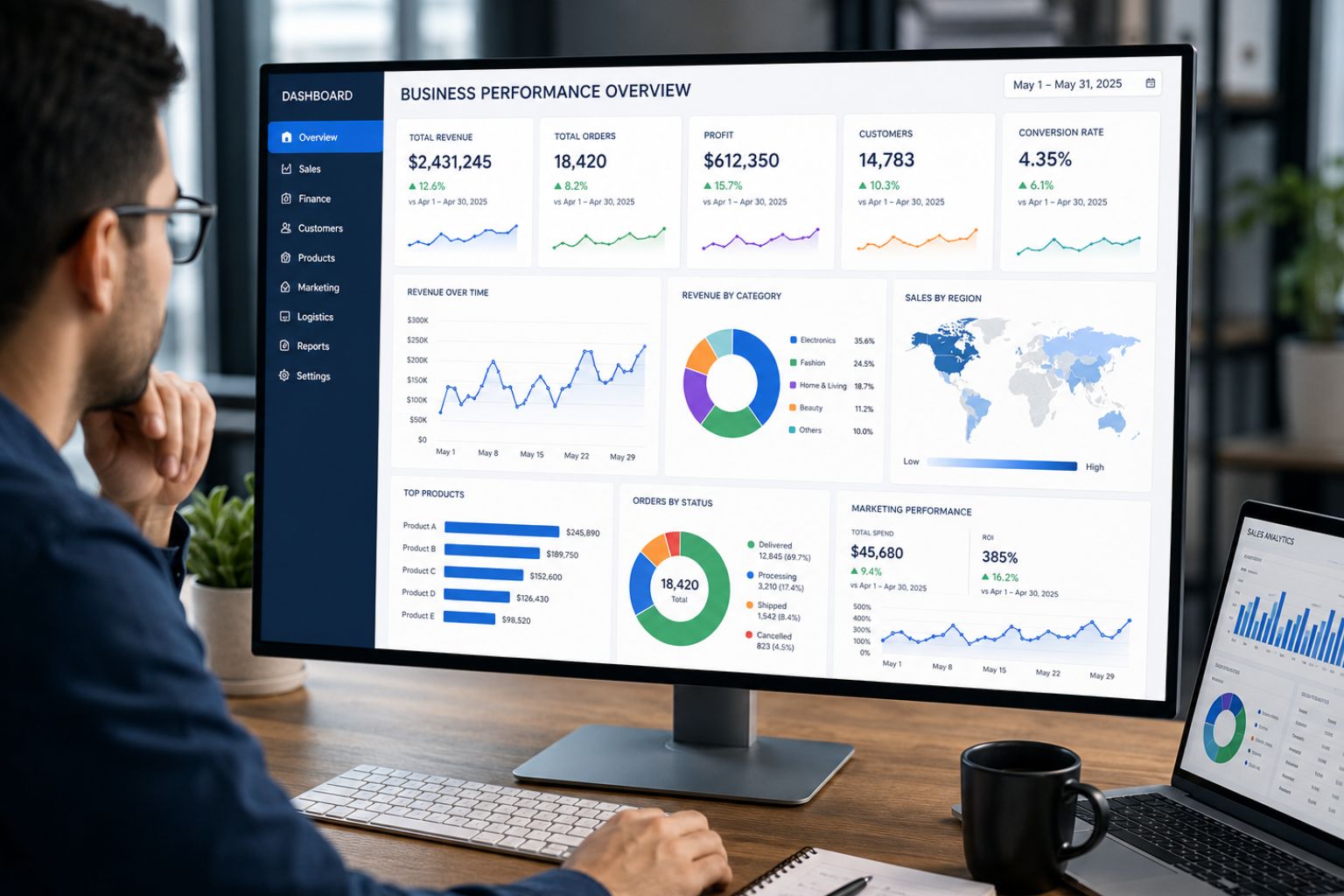
Whether you need a simple visual report, a Power BI dashboard, a Tableau dashboard, a Looker Studio report, an Excel dashboard, or a more advanced business intelligence reporting solution, we can help you build visuals that are practical, accurate, and easy to use.
With our data visualization services, you can monitor performance, compare trends, reduce manual reporting work, communicate results to stakeholders, and present complex information in a way that makes sense.
Request a Data Visualization Quote Now
Data Visualization Services That Make Complex Data Easier to Understand
Data only becomes useful when people can understand it quickly. A spreadsheet with thousands of rows may contain valuable information, but decision-makers need clear summaries, comparisons, trends, and alerts. Professional data visualization services & consulting help businesses convert raw data into visual reports that show what is happening, what has changed, and where action may be needed.
Good visual reporting helps teams track KPIs, identify performance gaps, compare results across departments, and explain findings to non-technical stakeholders. Instead of reviewing several disconnected files, your team can use one dashboard to monitor revenue, customer behavior, operational delays, marketing performance, project progress, or financial trends.
Our data visualization services for businesses are designed for practical decision-making. We do not only create attractive charts. We help structure the data, choose the right visuals, organize the dashboard layout, and make the final report useful for the people who will rely on it.
For example, a sales manager may need a dashboard that shows revenue by region, sales pipeline value, conversion rates, top-performing products, and underperforming territories. A logistics manager may need delivery delays, route efficiency, order fulfillment time, warehouse performance, and cost per shipment. A finance team may need budget tracking, cash flow movement, expense trends, and margin analysis.
Get a Custom Dashboard Consultation
What Our Data Visualization Services Include
Our service covers the full data visualization process, from understanding your reporting goals to preparing data, designing dashboards, building visuals, reviewing results, and delivering final reports. Each project is customized around your data sources, your audience, your preferred tools, and the decisions your team needs to make.
Custom Dashboard Design Services
We design dashboards for executives, managers, analysts, consultants, operations teams, sales departments, finance teams, HR teams, logistics teams, marketing departments, researchers, and client-facing reporting needs. A dashboard should not simply display charts. It should organize information in a way that helps users understand performance quickly.
Depending on your needs, we can help create Power BI dashboards, Tableau dashboards, Looker Studio dashboards, Excel dashboards, Google Sheets dashboards, web-based dashboards, executive dashboards, operational dashboards, and client reporting dashboards.
A strong dashboard starts with clear questions. What does the user need to know? Which KPIs matter most? Which comparisons are useful? How often will the report be updated? Who will use it? These questions shape the structure of the dashboard and prevent the final report from becoming cluttered or confusing.
KPI Dashboard Development
Our data visualization services for KPIs and metrics help businesses track the numbers that matter most. Instead of spreading KPIs across several files, we can help you build one structured dashboard that makes performance easier to monitor.
KPI dashboards can track revenue, profit margins, costs, sales performance, customer acquisition, customer retention, marketing results, inventory movement, delivery times, project progress, employee productivity, service quality, customer satisfaction, and risk indicators.
A good KPI dashboard should show more than numbers. It should show direction, comparison, and context. For example, a dashboard should help users see whether performance improved or declined, whether the current result is above or below target, and which area needs attention first.
Reporting & Data Visualization Services
Our reporting & data visualization services help businesses replace slow manual reports with cleaner, more professional, and easier-to-update reporting formats. This is useful when your team spends too much time copying data, formatting charts, rebuilding monthly reports, or preparing presentations manually.
We can help with weekly reports, monthly reports, board reports, investor reports, management reports, client reports, operational reports, PDF visual reports, Excel reports, KPI summaries, chart packs, and automated recurring reports.
Clear reporting is especially important when different stakeholders need different levels of detail. Executives may need a high-level summary, while managers may need department-level performance. Analysts may need filters and drill-downs. Clients may need polished visuals that explain results without overwhelming them.
Interactive Data Visualization Services
Our interactive data visualization services help businesses move beyond static charts. Interactive dashboards allow users to filter, drill down, compare, and explore data without creating a new report for every question.
Businesses searching for the best interactive data visualization services 2025 usually need dashboards that support real decision-making, not just colorful charts. Interactive visuals can include filters, slicers, drill-downs, maps, date controls, clickable dashboard sections, role-based views, dynamic charts, and scenario comparisons.
Interactive dashboards are useful when different users need different views from the same dataset. For example, a national sales director may want overall sales performance, while a regional manager may only need results for a specific territory. A marketing director may want campaign-level results, while a channel manager may need performance by platform.
Business Intelligence and Data Visualization Services
Our business intelligence and data visualization services help businesses combine data structure, KPI logic, reporting automation, and dashboard design. Business intelligence focuses on organizing data for decision-making. Data visualization makes that information easier to understand.
As a BI & data visualization services company, DataScienceConsultingPro can support projects involving data modeling, dashboard automation, calculated measures, KPI logic, data source integration, management dashboards, and performance reporting.
This service is useful when your business has data in several systems and needs one reliable reporting view. For example, you may need to combine CRM data, sales data, finance records, marketing performance, and customer data into one dashboard that helps leadership monitor business performance.
If your project requires deeper reporting infrastructure, our business-intelligence-services can support BI planning, dashboard logic, and decision-focused reporting systems.
Digital Data Visualization Services
Our digital data visualization services support businesses that need dashboards for online platforms, ecommerce, SaaS products, digital marketing campaigns, website analytics, and customer journeys. Digital teams often collect data from many platforms, but the challenge is turning that data into a clear view of performance.
We can help visualize website traffic, paid advertising results, ecommerce revenue, conversion funnels, lead generation, email marketing performance, app usage, online sales, customer acquisition costs, return on ad spend, and digital product engagement.
For example, an ecommerce business may need a dashboard that shows revenue by product, abandoned carts, conversion rate, refund trends, customer segments, and marketing campaign results. A SaaS company may need monthly recurring revenue, churn, activation rate, trial conversion, usage patterns, and customer lifetime value.
Big Data Visualization Services
Our big data visualization services help businesses create useful visual reports from large datasets that may be too difficult to review manually. Large datasets can include transaction records, customer behavior data, operational logs, database exports, cloud data, inventory records, support tickets, survey files, and financial records.
Big data visualization usually requires more than chart creation. The data may need cleaning, aggregation, modeling, filtering, and performance-conscious dashboard design. The goal is not to show every record. The goal is to summarize large volumes of information into trends, patterns, comparisons, and decision-ready insights.
If the dataset is messy or inconsistent, we can support preparation through data-cleaning-services before dashboard development begins. Clean data helps prevent misleading visuals and improves the accuracy of the final report.
AWS Data Visualization Services
Our AWS data visualization services support businesses that use AWS-connected data sources, cloud exports, databases, or analytics pipelines. Depending on your data structure and reporting goals, we can help plan or build dashboards using AWS-connected datasets, exported cloud data, or BI tools connected to your data environment.
This is useful for organizations that already store data in the cloud but need clearer reporting views for managers, executives, analysts, or clients. AWS-based reporting projects may involve large datasets, recurring exports, database-connected dashboards, or cloud-based business intelligence workflows.
Data Visualization Consulting for Better Reporting Decisions
Many businesses do not only need charts. They need data visualization consulting to decide what should be measured, how the dashboard should be structured, and which visuals will make the data easier to use.
Our data visualization consultants can help you choose the right KPIs, identify the best dashboard tool, clean and prepare data, structure reports by audience, select suitable chart types, avoid misleading visuals, simplify cluttered dashboards, improve existing reports, and plan reporting automation.
This consulting step is important because a dashboard can look professional but still fail if it tracks the wrong metrics or presents information in the wrong way. A finance dashboard, for example, should not simply show revenue. It should explain revenue movement, cost behavior, margin changes, budget variance, and financial risks. A logistics dashboard should not only show delivery count. It should show delays, route efficiency, fulfillment gaps, and cost drivers.
If you need broader support beyond visualization, our data analytics services can help you analyze patterns, interpret results, and prepare findings before creating final dashboards.
Talk to a Data Visualization Consultant
Data Visualization Services for Businesses Across Departments
Different teams need different reporting views. A CEO, finance manager, sales director, logistics coordinator, HR manager, and marketing lead may all use business data differently. Our data visualization services for businesses can be customized for each department’s goals, reporting frequency, and decision-making needs.
| Department or Business Need | Visualization Solution | Example Deliverables |
|---|---|---|
| Executive reporting | High-level business dashboard | Revenue, cost, profit, growth, risk, and performance summary |
| Sales performance | Sales dashboard | Sales by rep, region, product, pipeline stage, and conversion rate |
| Marketing analytics | Campaign dashboard | Traffic, leads, conversions, ad spend, ROI, and channel performance |
| Finance reporting | Financial dashboard | Revenue, expenses, cash flow, margins, budget tracking, and variance |
| Operations reporting | Operational dashboard | Productivity, delays, output, bottlenecks, and efficiency |
| Logistics reporting | Logistics dashboard | Delivery time, shipment delays, route performance, and cost per delivery |
| Customer analytics | Customer dashboard | Retention, churn, satisfaction, customer value, and complaints |
| HR reporting | HR dashboard | Headcount, turnover, attendance, recruitment, and productivity |
| Project tracking | Project dashboard | Milestones, timelines, risks, task completion, and progress status |
| Research reporting | Survey visualization | Response trends, demographics, satisfaction scores, and grouped findings |
| Ecommerce reporting | Ecommerce dashboard | Orders, revenue, refunds, product performance, and customer behavior |
| SaaS reporting | SaaS metrics dashboard | MRR, churn, activation, subscriptions, and user engagement |
| Healthcare reporting | Healthcare dashboard | Patient flow, service metrics, quality indicators, and operations data |
Logistics Data Visualization Services
Our logistics data visualization services help logistics companies, transport teams, warehouse managers, dispatch teams, supply chain teams, and operations leaders monitor performance more clearly. Logistics data often comes from delivery systems, warehouse records, supplier reports, inventory files, fleet summaries, order systems, and customer service records. Without clear visualization, it can be difficult to see where delays, costs, and performance gaps are happening.
We can help create dashboards that track delivery performance, shipment delays, route efficiency, fleet summaries, order fulfillment, warehouse performance, supplier performance, inventory movement, dispatch activity, cost per delivery, regional performance, and service-level performance.
A logistics dashboard can show delivery volume by region, late deliveries by route, average fulfillment time, cost per shipment, warehouse backlog, and supplier delay trends in one view. This helps managers identify operational bottlenecks and make faster decisions about staffing, routing, inventory, or supplier follow-up.
Tools We Use for Data Visualization Projects
The right visualization tool depends on your data, reporting goals, budget, sharing needs, automation requirements, and existing systems. We do not force one tool onto every project. A small business may only need an Excel or Google Sheets dashboard, while a growing company may need Power BI, Tableau, Looker Studio, SQL-connected reporting, or a custom dashboard.
| Tool | Best For | Common Use Cases |
|---|---|---|
| Power BI | Business intelligence dashboards | KPI dashboards, financial reports, sales dashboards, management reporting |
| Tableau | Advanced visual analytics | Interactive dashboards, executive reporting, complex comparisons |
| Looker Studio | Web and marketing reporting | Website analytics, Google-based reporting, campaign dashboards |
| Excel | Simple business reporting | Static reports, financial templates, basic dashboards |
| Google Sheets | Shared lightweight reporting | Collaborative dashboards, simple team reports, recurring updates |
| Python | Custom analytics and automation | Advanced charts, data processing, automated visual reports |
| R | Research and statistical visualization | Survey data, academic research, statistical reporting |
| SQL | Database-connected reporting | Data extraction, joins, structured dashboard inputs |
| AWS-connected data sources | Cloud-based reporting | Cloud exports, large datasets, database reporting |
| Custom web dashboards | Tailored reporting needs | Client portals, internal dashboards, specialized reporting systems |
If your main goal is to build a professional reporting interface, our dashboard-development-services can help with dashboard structure, visual layout, filters, and user-friendly reporting design.
Why Choose DataScienceConsultingPro as Your Data Visualization Services Company?
Choosing the right data visualization services company matters because dashboards influence decisions. A poorly designed dashboard can hide important trends, confuse users, or create misleading conclusions. A good dashboard helps people understand performance quickly and act with more confidence.
Businesses comparing data visualization services companies often need more than attractive charts. They need a team that can understand the data, organize the reporting logic, design useful visuals, and explain what the numbers mean for business decisions.
DataScienceConsultingPro focuses on custom dashboard design, business-first reporting logic, clean visual layout, clear KPI hierarchy, tool flexibility, practical recommendations, dashboard automation options, clear communication, defined deliverables, and flexible project scopes.
The best data visualization services combine data structure, business context, visual clarity, and usability. That is why our approach focuses on what the dashboard needs to help users decide, not only how the dashboard looks.
How We Build Trust Into Every Data Visualization Project
Data visualization projects often involve sensitive business information. We handle each project with clear communication, defined expectations, and careful attention to the client’s data. Before work begins, we clarify the project scope, expected deliverables, available data, preferred tools, reporting goals, and revision process.
We also review data quality before full dashboard development. If the dataset has missing values, duplicates, inconsistent formats, unclear categories, or conflicting records, we explain the issue rather than creating visuals that may mislead users. This helps protect the accuracy and usefulness of the final report.
Our approach includes confidential handling of client data, practical data review, secure file-sharing expectations where needed, clear communication during the project, reasonable revisions based on scope, and proper final handover of dashboards, files, reports, or documentation.
Outsource Data Visualization Services and Save Reporting Time
Many companies choose to outsource data visualization services because internal teams are busy, reports take too long to prepare, or the business does not have a dedicated dashboard specialist. Outsourcing can help you get professional dashboards without hiring a full-time BI expert.
This is useful when Excel reporting has become too large, dashboards look unprofessional, data is spread across several systems, leadership needs clearer reporting, clients expect polished visuals, or teams need recurring reports prepared faster.
Outsourcing also helps when your business needs a dashboard for a presentation, board meeting, investor update, client report, operational review, or monthly performance report. Instead of spending hours formatting charts manually, you can work with a specialist who understands dashboard design, reporting structure, and data presentation.
Outsource your data visualization project to DataScienceConsultingPro and request a quote today.
Data Visualization Services USA, Dubai, Philippines, and Global Clients
Whether you are looking for data visualization services USA, data visualization services in the USA, data visualization services in Dubai, data visualization services Philippines, or support in another location, DataScienceConsultingPro can support your project remotely.
Our process allows clients to share data, explain reporting goals, review dashboard drafts, request revisions, and receive polished visual reports without needing an in-person meeting. This makes the service suitable for businesses, agencies, consultants, and teams across different regions.
Remote service delivery is especially useful for data projects because most dashboard work can be completed through secure data sharing, online consultations, project updates, and digital delivery of files or dashboard access.
Our Data Visualization Process
A successful data visualization project needs clear planning. We follow a structured process so the final dashboard is useful, accurate, and aligned with your reporting goals.
1. Project Discovery
We start by understanding your business, reporting problem, audience, current tools, available data, and expected deliverables. This step helps determine whether you need a static visual report, KPI dashboard, interactive BI dashboard, automated report, or visual presentation.
2. Data Review
We review your available data to understand its format, structure, completeness, and quality. Your data may come from Excel, Google Sheets, CSV files, databases, CRM exports, ERP systems, survey files, finance records, or cloud platforms.
3. KPI and Reporting Goal Clarification
We clarify the metrics that matter before design begins. These may include revenue, profit, conversion rate, delivery time, customer retention, order volume, campaign performance, inventory movement, or project progress.
4. Data Cleaning and Preparation
Many dashboard projects require data cleaning. This may involve formatting dates, removing duplicates, standardizing categories, merging files, fixing inconsistent fields, creating calculated columns, or preparing data for dashboard use.
5. Dashboard Structure and Wireframe
We plan the dashboard layout before full development. This helps organize KPIs, filters, charts, comparisons, and sections in a logical way. A clear structure prevents clutter and makes the dashboard easier to use.
6. Visualization Design and Development
We build the dashboard or report using the selected tool. This stage includes chart selection, dashboard layout, formulas, filters, visual hierarchy, formatting, and interactivity.
7. Review and Revisions
You review the draft and provide feedback based on the agreed project scope. Revisions may include changing chart types, improving labels, reorganizing sections, adjusting filters, or refining KPI definitions.
8. Final Delivery and Handover
We deliver the final dashboard, report, visual files, documentation, or access instructions depending on the project. Deliverables may include Power BI reports, Tableau workbooks, Excel dashboards, Looker Studio reports, PDF reports, or chart packs.
9. Optional Maintenance and Reporting Support
Some clients need ongoing support after delivery. This may include monthly reporting, data refreshes, new metrics, dashboard improvements, additional dashboard pages, or recurring visual reports.
Data Visualization Pricing
Data visualization pricing depends on project complexity. A simple static visual report usually costs less than an interactive dashboard with multiple data sources, filters, automation, and advanced KPI logic.
Pricing depends on the number of dashboards, number of data sources, level of data cleaning, tool used, dashboard interactivity, automation requirements, KPI complexity, visual design needs, reporting frequency, urgency, number of revisions, and documentation requirements.
| Package | Best For | Typical Deliverables | Starting Price |
|---|---|---|---|
| Basic Visual Report Package | Simple charts and static visuals | Cleaned visuals, summary charts, PDF or Excel report | Custom quote |
| KPI Dashboard Package | Businesses tracking key metrics | KPI dashboard, summary charts, filters, performance views | Custom quote |
| Interactive BI Dashboard Package | Teams needing dynamic reporting | Filters, slicers, drill-downs, multiple dashboard pages | Custom quote |
| Advanced Data Visualization Consulting Package | Complex data or reporting strategy | Data review, KPI planning, dashboard structure, recommendations | Custom quote |
| Ongoing Reporting Support Package | Recurring reports and updates | Monthly reports, dashboard updates, new metrics, maintenance | Custom quote |
For an accurate price, send your project details, data format, preferred tool, number of data sources, and the type of dashboard or report you need.
Request a Custom Data Visualization Quote
Examples of Data Visualization Projects We Can Help With
DataScienceConsultingPro can support many types of dashboard and reporting projects. These include sales performance dashboards, financial performance dashboards, marketing campaign dashboards, customer behavior dashboards, logistics dashboards, inventory dashboards, KPI scorecards, HR dashboards, employee productivity dashboards, survey results dashboards, research findings visualizations, executive summary dashboards, operational performance dashboards, Power BI dashboards, Tableau dashboards, Looker Studio dashboards, Excel dashboards, AWS data dashboards, big data dashboards, e-commerce dashboards, SaaS metrics dashboards, client reporting dashboards, investor reporting dashboards, and management reporting dashboards.
Each project can be customized based on your audience, industry, reporting frequency, preferred tools, and available data. If your data is not ready for visualization, we can help prepare it first. If your report needs deeper interpretation, our data reporting services can help you turn dashboards into structured reports for clients, managers, executives, or stakeholders.
Common Problems Our Data Visualization Services Solve
Many businesses already have the data they need, but they struggle to use it effectively. Reports may take too long to prepare, Excel files may be overloaded, dashboards may be cluttered, KPIs may be unclear, or managers may not trust the numbers because different teams use different versions of the data.
Our service helps solve these problems by organizing the data, cleaning it where needed, selecting useful metrics, designing clear visuals, and presenting information in a format that supports decisions. This can reduce manual reporting work and improve how teams communicate performance.
Professional visualization is especially useful when reports do not answer business questions clearly. A dashboard should not force users to search for meaning. It should guide them toward the most important trends, comparisons, risks, and opportunities.
What Makes a Good Data Visualization Dashboard?
A good dashboard should help users understand what happened, why it matters, and what action may be needed. It should have a clear purpose, accurate data, correct chart selection, logical KPI hierarchy, clean layout, readable labels, useful filters, meaningful comparisons, and minimal clutter.
Good dashboards are designed around the user. An executive dashboard should summarize business health quickly. A manager dashboard should show operational performance and exceptions. An analyst dashboard may need filters, drill-downs, and deeper exploration. A client report should be polished, clear, and easy to explain.
A dashboard should never overwhelm the user with unnecessary charts. Every visual should support a decision, comparison, trend, or explanation.
Static Reports vs Interactive Dashboards
Some businesses need static reports, while others need interactive dashboards. The right option depends on how the report will be used, how often the data changes, and whether users need to explore the data themselves.
| Feature | Static Report | Interactive Dashboard |
|---|---|---|
| Best use case | Presentations, board reports, fixed summaries | Ongoing monitoring and exploration |
| Interactivity | Limited or none | Filters, slicers, drill-downs, dynamic views |
| Update frequency | One-time or periodic | Recurring, automated, or refreshable |
| User exploration | User reads fixed visuals | User explores by date, segment, or category |
| Cost | Usually lower | Usually higher depending on complexity |
| Delivery format | PDF, PowerPoint, Excel, image files | Power BI, Tableau, Looker Studio, web dashboard |
| Ideal users | Executives, clients, investors | Managers, analysts, operations teams, BI users |
Static reports are useful for meetings, investor updates, board packs, and client summaries. Interactive dashboards are better when users need to explore performance, filter results, and monitor changing data over time.
Data Visualization Deliverables You Can Request
The final deliverables depend on your project scope, selected tool, and reporting goals. You can request dashboard files, interactive dashboards, Excel dashboards, Power BI reports, Tableau workbooks, Looker Studio reports, PDF visual reports, executive summary visuals, KPI scorecards, chart packs, reporting templates, cleaned datasets, dashboard documentation, visual storytelling reports, recurring reporting templates, dashboard redesigns, management report templates, or client-facing reports.
If you are not sure what deliverable you need, we can help you choose the most practical option based on your data, budget, audience, and update requirements. For broader analytics and modeling support, our data science consulting services can help with more advanced data strategy, analytics planning, and business insight development.
Request Data Visualization Services Today
If your business has data but struggles to turn it into clear reports, dashboards, and decision-ready insights, DataScienceConsultingPro can help. Our data visualization services support businesses that need KPI dashboards, interactive visuals, business intelligence reporting, data storytelling, executive dashboards, and reporting automation.
Whether you need a simple visual report, a professional Excel dashboard, an interactive Power BI dashboard, a Tableau dashboard, a Looker Studio report, or a custom reporting solution, we can help you create visuals that are clear, accurate, and useful.
Request a Data Visualization Quote
FAQs About Data Visualization Services
Data visualization services help turn raw data into charts, dashboards, KPI scorecards, reports, maps, and interactive visuals. These services make complex information easier to understand, compare, and use for business decisions.
They may include data cleaning, KPI planning, dashboard design, chart creation, reporting automation, business intelligence reporting, and visual storytelling.
A data visualization services company helps clients organize data and present it visually. This can include creating dashboards in Power BI, Tableau, Looker Studio, Excel, Google Sheets, or custom dashboard platforms.
The company may also help select KPIs, clean data, design report layouts, create interactive filters, and prepare executive-ready reports.
A business should invest in data visualization services when reports are difficult to understand, dashboards are cluttered, spreadsheets are too large, or managers cannot quickly see performance.
Good visual reporting helps teams monitor KPIs, identify trends, reduce manual reporting, communicate results clearly, and make faster decisions.
Yes. We can create dashboards from Excel or Google Sheets data if the data is suitable for reporting. If the spreadsheet is messy, we can clean, restructure, format, or combine the data before creating the visuals.
Yes. Depending on the project, we can help with Power BI dashboards, Tableau dashboards, Looker Studio reports, Excel dashboards, and other visual reporting formats.
The best tool depends on your data source, reporting goals, access needs, budget, and interactivity requirements.
Yes. You can outsource data visualization services if your team lacks the time, tools, or dashboard expertise to build professional reports internally.
Outsourcing is useful when you need cleaner dashboards, better KPI tracking, faster report preparation, or polished visuals for managers, clients, or executives.
Data visualization services are useful in finance, logistics, ecommerce, SaaS, healthcare, marketing, consulting, education, real estate, operations, retail, research, and professional services.
Any business that tracks customers, revenue, costs, performance, projects, or operations can benefit from clearer visual reporting.
Yes. We can help create logistics dashboards that track delivery performance, shipment delays, route efficiency, fleet summaries, warehouse performance, supplier performance, inventory movement, order fulfillment, and cost per delivery.
These dashboards help logistics and operations teams identify bottlenecks and improve reporting visibility.
The cost depends on the number of dashboards, data sources, tool used, data cleaning needs, interactivity, automation, KPI complexity, and reporting frequency.
A simple visual report usually costs less than a multi-page interactive BI dashboard. The best way to get accurate pricing is to request a custom quote.
Yes. We can create interactive dashboards with filters, slicers, drill-downs, dynamic charts, date controls, maps, and multiple dashboard views.
Interactive dashboards are useful when users need to explore data by department, region, product, campaign, customer type, or time period.
Yes. DataScienceConsultingPro can support clients remotely in different regions, including businesses looking for data visualization services in the USA, Dubai, the Philippines, and other locations.
The process can be handled online through data sharing, project discussions, dashboard drafts, revisions, and final delivery.
Data visualization focuses on presenting data through charts, dashboards, maps, and visual reports. Business intelligence is broader and may include data modeling, KPI logic, reporting systems, data integration, and decision-support processes.
In many projects, both work together. Business intelligence structures the data, while visualization makes the insights easier to understand.
Yes. Many dashboard projects require data cleaning before visualization. We can help format dates, remove duplicates, standardize categories, fix inconsistent fields, combine files, and prepare datasets for reporting.
Clean data helps produce more accurate dashboards and clearer visuals.
The timeline depends on project size, data quality, number of dashboards, selected tool, and revision needs. A simple visual report may take less time, while a complex interactive dashboard with several data sources may require more planning, cleaning, development, and testing.
Yes. We can improve existing dashboards by simplifying the layout, correcting chart choices, reorganizing KPIs, improving filters, cleaning visuals, adding missing metrics, and making the report easier to use.
Dashboard redesign is useful when a report has become cluttered, confusing, slow, outdated, or misaligned with current business goals.