Many businesses collect sales data every day, but they still struggle to see what is really happening in sales performance. Revenue may be stored in Excel files, CRM exports, POS systems, accounting platforms, eCommerce reports, or monthly sales spreadsheets. When these records are scattered, sales managers spend too much time preparing reports and too little time acting on insights.
That delay can cost the business. A slow report can hide missed targets, weak regions, declining products, low-margin sales, poor pipeline movement, or sales representatives who need support. By the time the report is ready, the opportunity to correct the problem may already be gone.
A Power BI sales dashboard solves this problem by turning scattered sales data into one interactive report. It helps business owners, executives, sales managers, analysts, and operations teams track revenue, profit, sales targets, products, customers, regions, sales representatives, pipeline performance, and forecasts in one place.
The best Power BI sales dashboard examples are not just attractive visuals. They are decision-making tools that help a business understand sales performance faster. Instead of guessing from scattered reports, managers can answer important questions such as: Are sales growing? Which products are profitable? Are any regions behind target? Do some sales representatives need support? Where is repeat revenue coming from? How much future sales can the business expect?
At DataScienceConsultingPro.com, we help businesses turn raw sales data into clean, interactive dashboards that support faster decisions. We can help with data cleaning, Power BI dashboard development, sales KPI reporting, Excel to Power BI migration, dashboard automation, and custom business intelligence reporting.
Have sales data in Excel, CRM, POS, accounting software, or eCommerce reports? Send your sample file, dashboard idea, or reporting requirements to DataScienceConsultingPro.com and request a quote now.
What Is a Power BI Sales Dashboard?
A Power BI sales dashboard is an interactive business intelligence report that helps companies monitor sales performance. It uses KPI cards, charts, slicers, filters, drill-through pages, and connected data sources to show how the sales function is performing.
A well-built Power BI sales dashboard can show revenue, gross profit, profit margin, sales growth, target achievement, product performance, customer performance, regional performance, sales representative performance, pipeline value, and forecasted sales. These metrics help managers understand both the overall sales position and the details behind the numbers.
Unlike a static Excel report, Power BI allows users to filter data by date, product, region, customer, branch, salesperson, or business unit. This makes it easier to move from a high-level summary to detailed analysis without rebuilding reports manually. For a deeper comparison, read our guide on Power BI vs Excel.
Manual Sales Reports vs Power BI Sales Dashboards
Many companies start with manual sales reports because Excel is familiar and flexible. However, as the business grows, manual reporting becomes slower, harder to maintain, and more prone to errors. A Power BI sales dashboard becomes more useful when the business needs interactive reporting, automated updates, multiple data sources, and clearer performance visibility.
| Reporting Area | Manual Sales Reports | Power BI Sales Dashboards |
|---|---|---|
| Data updates | Often updated manually | Can be refreshed from connected data sources |
| Interactivity | Limited filtering and exploration | Interactive slicers, filters, and drill-through pages |
| Reporting speed | Can take hours or days to prepare | Users can review updated dashboards faster |
| Data sources | Often one file at a time | Can combine Excel, CRM, POS, accounting, and other data |
| KPI tracking | Requires manual formulas | Uses reusable measures and data models |
| Visual reporting | Static charts and tables | Interactive visuals, KPI cards, maps, and trend charts |
| Decision-making | Often delayed | Faster visibility into sales performance |
| Scalability | Harder as data grows | Better for growing reporting needs |
If your sales team spends too much time preparing reports, copying data, fixing spreadsheets, or explaining inconsistent numbers, a Power BI sales dashboard can help create a more reliable reporting process.
Why Businesses Use Power BI Sales Dashboards
Businesses use Power BI sales dashboards because sales decisions need accurate and timely information. A sales report that takes days to prepare can delay action, especially when managers need to respond quickly to missed targets, declining revenue, weak products, or poor regional performance.
A Power BI sales dashboard helps businesses:
- Track revenue and profit in one place
- Monitor monthly, quarterly, and yearly sales trends
- Compare actual sales against targets
- Identify top and low-performing products
- Compare regions, branches, stores, or territories
- Review sales representative performance
- Track pipeline value and win rate
- Understand customer buying patterns
- Reduce manual reporting work
- Improve forecasting and planning
For example, a sales manager can filter the dashboard by branch and quickly see which region is behind target. A CEO can open the executive page and review revenue, profit, growth, and top products. A sales operations team can use a pipeline dashboard to see where deals are getting stuck.
This is why Power BI is valuable for businesses that want better business intelligence, stronger sales reporting, and faster decision-making.
Best KPIs to Include in a Power BI Sales Dashboard
The value of a sales dashboard depends on the KPIs it tracks. A dashboard with too many metrics becomes confusing, while a dashboard with too few metrics may not give enough insight. The right KPIs should reflect the sales decisions your business needs to make.
A strong Power BI sales dashboard should combine revenue, profit, targets, customers, products, regions, and sales team performance. This gives decision-makers a complete view of sales performance instead of one isolated number. You can also read our guide on how to analyze sales data for a deeper understanding of sales analysis.
| KPI | What It Measures | Why It Matters | Best Power BI Visual |
|---|---|---|---|
| Total revenue | Total sales generated | Shows overall sales performance | KPI card |
| Gross profit | Revenue after direct costs | Shows whether sales generate real value | KPI card |
| Profit margin | Profit as a percentage of revenue | Helps identify profitable sales | KPI card or gauge |
| Sales growth | Increase or decrease in sales | Shows whether sales are improving | Line chart |
| Monthly sales trend | Sales by month | Helps identify patterns and seasonality | Line chart |
| Year-over-year sales | Current year vs previous year | Shows long-term growth or decline | Column chart |
| Target achievement | Actual sales compared to target | Shows whether goals are being met | Gauge or bullet chart |
| Sales variance | Difference between actual and target sales | Shows overperformance or underperformance | Bar chart |
| Average order value | Average revenue per order | Shows order quality | KPI card |
| Number of orders | Total sales transactions | Shows sales volume | Column chart |
| Units sold | Quantity sold | Helps with product and inventory planning | Bar chart |
| Conversion rate | Percentage of leads converted | Measures sales effectiveness | Funnel chart |
| Sales pipeline value | Value of open opportunities | Shows potential future revenue | KPI card |
| Win rate | Percentage of deals won | Measures sales team performance | KPI card |
| Customer retention | Customers who continue buying | Shows loyalty and repeat revenue | Line chart |
| Top products | Highest-performing products | Identifies major revenue drivers | Bar chart |
| Top regions | Highest-performing locations | Helps compare territories | Map or bar chart |
| Top sales representatives | Best-performing salespeople | Supports team performance review | Ranking table |
| Discount impact | Effect of discounts on revenue or profit | Helps control over-discounting | Waterfall chart |
| Forecasted sales | Expected future revenue | Supports planning and budgeting | Forecast line chart |
10 Power BI Sales Dashboard Examples
The following Power BI sales dashboard examples show different dashboard types you can build depending on your business goals. Add your dashboard screenshot, mockup, or Power BI export image in the spaces provided.
Each dashboard should be original, clean, and relevant to your business audience. Avoid copying competitor dashboard images unless you have permission or the image is properly licensed.
1. Sales Executive Dashboard
A sales executive dashboard is designed for business owners, CEOs, founders, directors, and senior sales managers. It gives a high-level view of sales performance without overwhelming the reader with too much detail. The goal is to help decision-makers see whether the business is growing, whether targets are being met, and which areas need attention.
This dashboard should help executives understand revenue growth, profit performance, sales targets, regional performance, product contribution, and customer value. It should be easy to scan because senior decision-makers usually need a clear summary before they investigate detailed reports.
Include these elements in the dashboard:
- Total revenue KPI card
- Gross profit KPI card
- Profit margin KPI card
- Sales growth KPI card
- Target achievement visual
- Monthly revenue trend
- Sales by region
- Top products
- Top customers
- Revenue by sales channel
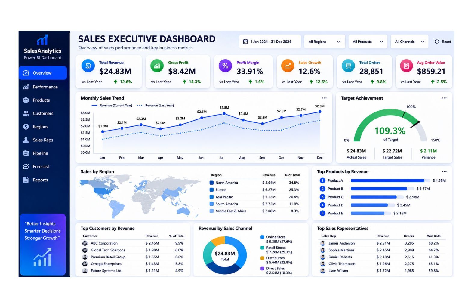
DataScienceConsultingPro.com can build a custom executive sales dashboard that combines your sales, customer, product, region, and profitability data into one decision-ready Power BI report. Request a sales executive dashboard quote now.
2. Sales Performance Dashboard
A sales performance dashboard tracks sales results across months, quarters, products, branches, regions, and sales representatives. It is useful for sales managers, business analysts, department heads, and operations managers who need to monitor whether the business is meeting sales goals.
This dashboard helps users understand how much the business sold during a specific period, whether sales are improving or declining, which products are performing well, and which regions or sales representatives need support. It is one of the most useful Power BI sales dashboard examples because it supports routine sales reviews and management meetings.
Include these elements in the dashboard:
- Total sales
- Monthly sales trend
- Sales growth
- Target achievement
- Sales variance
- Sales by product
- Sales by region
- Sales by representative
- Number of orders
- Average order value
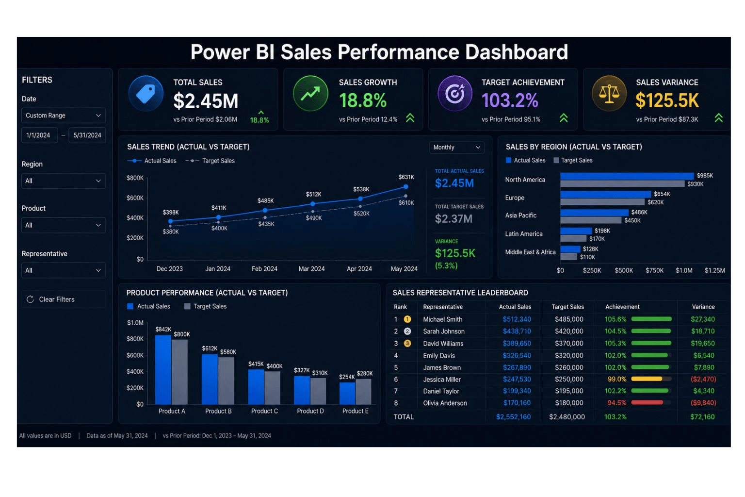
If you already have monthly sales files, DataScienceConsultingPro.com can turn them into a clean Power BI sales performance dashboard with automated KPIs and filters. Request a quote now.
3. Sales Pipeline Dashboard
A sales pipeline dashboard tracks leads, opportunities, deal stages, expected revenue, win rate, and forecasted sales. It is ideal for B2B companies, agencies, consulting firms, SaaS businesses, and sales teams that use CRM data.
This dashboard helps sales teams understand how many opportunities are active, where deals are getting stuck, which sales representatives have strong pipelines, and how much future revenue may be expected. It is especially useful for companies that need better visibility into leads, sales stages, and expected revenue.
Include these elements in the dashboard:
- Total leads
- Qualified leads
- Open opportunities
- Pipeline value
- Weighted pipeline value
- Win rate
- Average deal size
- Expected revenue
- Deal stage breakdown
- Sales cycle length
- Lost deals
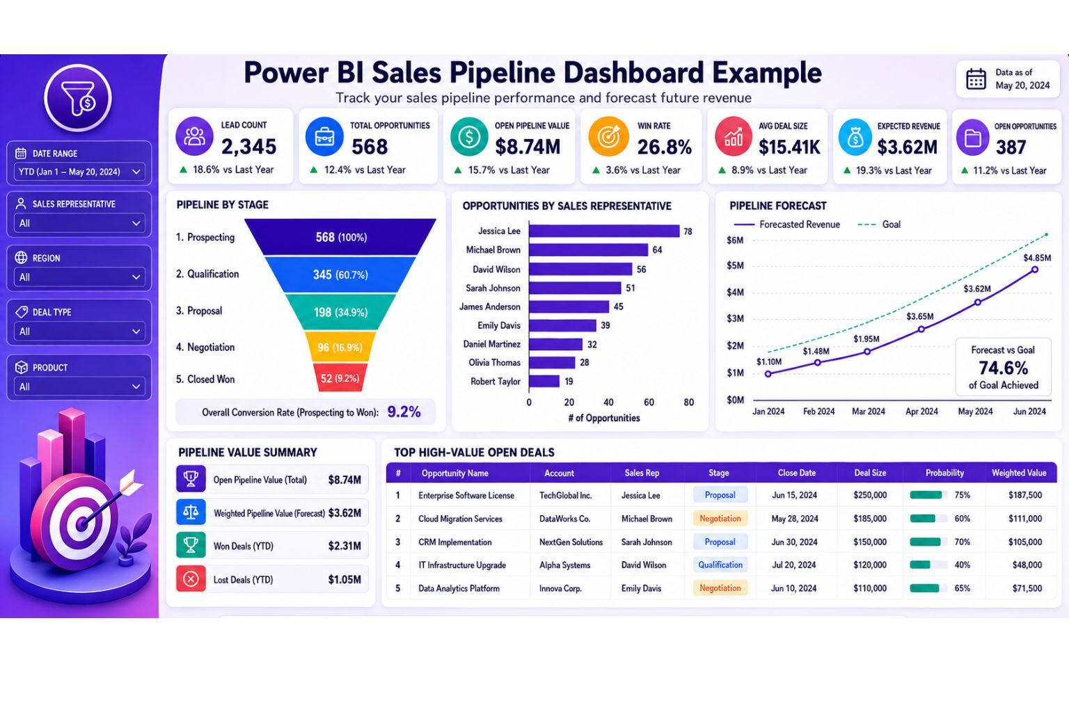
DataScienceConsultingPro.com can create a sales pipeline dashboard using CRM exports, lead data, opportunity records, and sales targets. Request a sales pipeline dashboard proposal now.
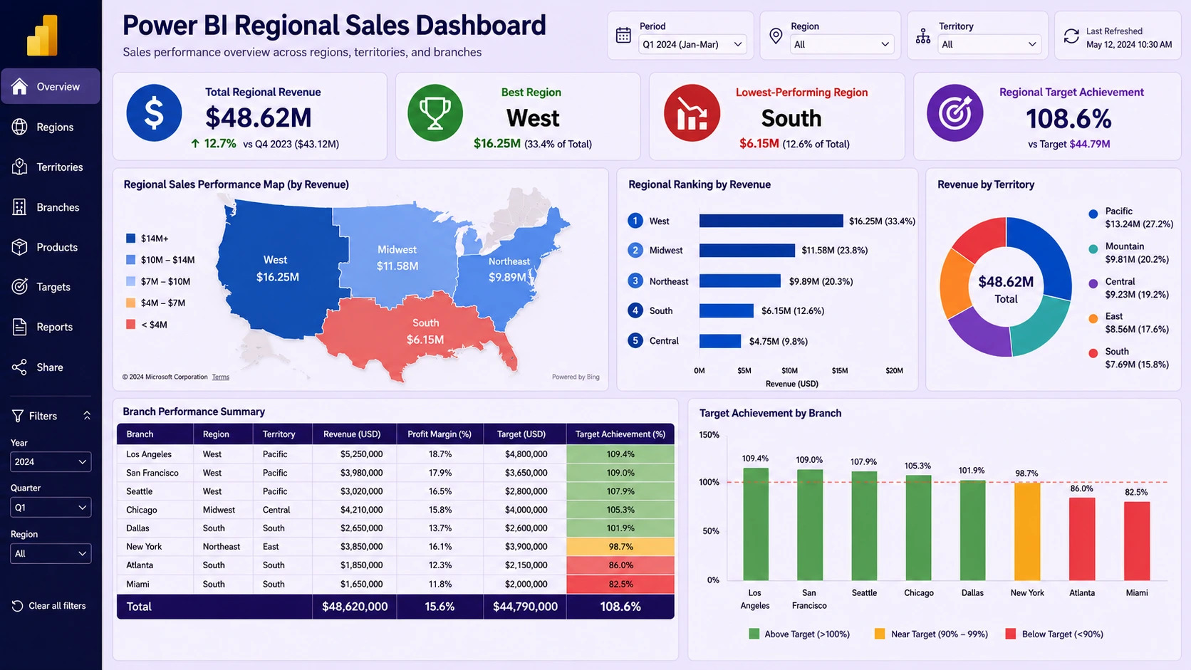
4. Regional Sales Dashboard
A regional sales dashboard compares sales across countries, states, counties, territories, branches, stores, or sales zones. It is useful for companies with multiple locations or distributed sales teams.
This dashboard helps managers identify which locations are performing well, which branches are behind target, and where the company may need to increase sales support, marketing activity, or operational attention. It is also useful when management wants to compare regional revenue, branch targets, and location profitability.
Include these elements in the dashboard:
- Revenue by region
- Profit by region
- Target achievement by region
- Sales growth by territory
- Orders by branch
- Regional profit margin
- Top-performing locations
- Underperforming locations
DataScienceConsultingPro.com can build regional sales dashboards for retail chains, distributors, agencies, service companies, and multi-branch businesses. You can also explore our dashboard development services if you need a custom dashboard solution.
5. Product Sales Dashboard
A product sales dashboard shows which products, categories, brands, or services generate the most sales and profit. It is useful for retailers, eCommerce companies, wholesalers, manufacturers, SaaS businesses, and service providers.
This dashboard helps businesses decide which products to promote, which products to review, which categories are growing, and which items may be slow-moving or unprofitable. A good product dashboard should not only show sales volume. It should also show profit margin, discounts, category performance, and product trends.
Include these elements in the dashboard:
- Product revenue
- Units sold
- Gross profit
- Profit margin
- Category performance
- Top products
- Slow-moving products
- Discount impact
- Product sales growth
- Revenue by brand
If your product data is messy, we can help clean and structure it before dashboard development. Learn more about our data cleaning services or request a quote now.
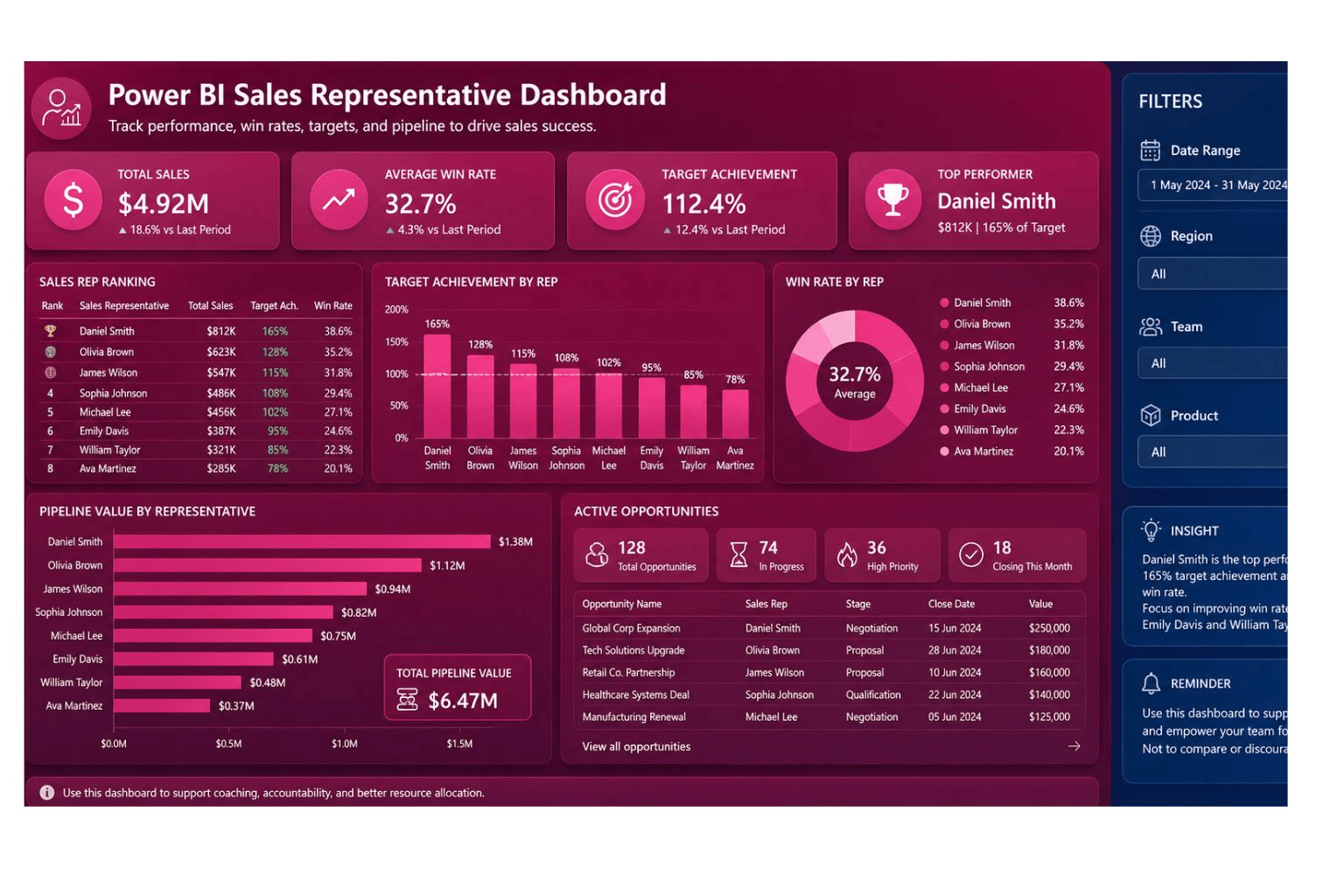
6. Sales Representative Performance Dashboard
A sales representative performance dashboard compares individual salespeople based on revenue, target achievement, win rate, number of deals, average deal size, and pipeline activity. It is useful for sales managers who want fair performance reviews, coaching insights, and better team visibility.
This dashboard should not be used only to rank people. It should help managers understand performance patterns, identify training needs, and allocate support where it is needed. When designed correctly, it supports coaching, accountability, and better sales management.
Include these elements in the dashboard:
- Revenue by sales rep
- Target achievement
- Win rate
- Number of deals closed
- Average deal size
- Open opportunities
- Follow-up activity
- Pipeline value by rep
- Lost deals by rep
- Sales rep ranking
DataScienceConsultingPro.com can create sales representative dashboards that help managers track performance with accurate KPIs and clean data. Request your custom dashboard quote now.
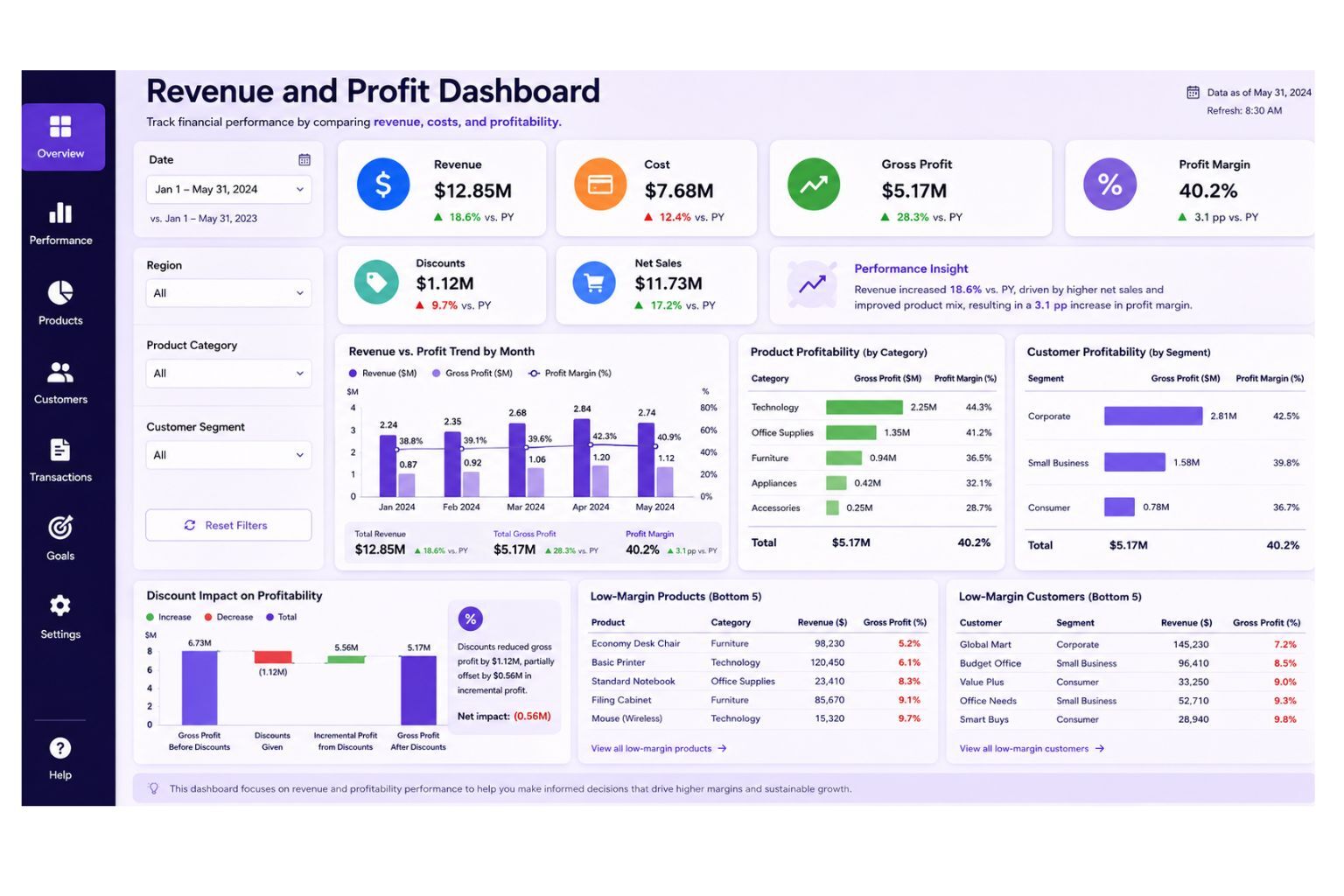
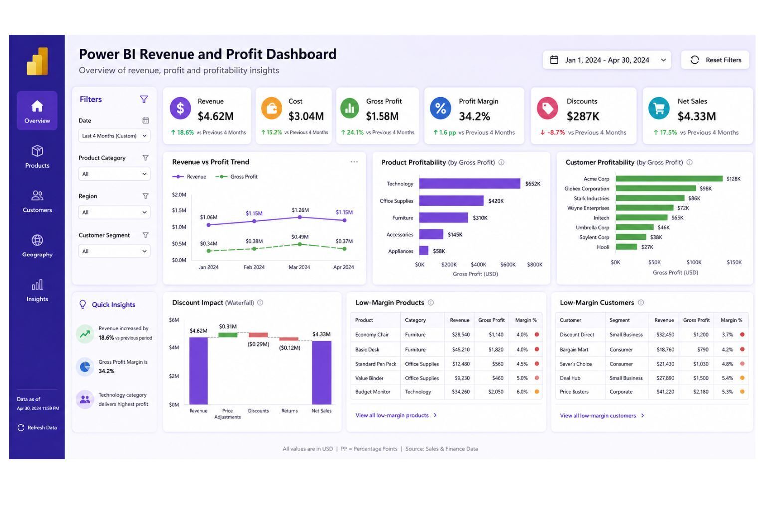
7. Revenue and Profit Dashboard
A revenue and profit dashboard shows whether sales growth is producing profitable growth. Many businesses track revenue but ignore cost, discounts, gross profit, and margin. This can lead to poor decisions because high revenue does not always mean strong profit.
This dashboard helps business owners, finance teams, and sales leaders understand whether sales activity is producing real business value. It is especially important for businesses that sell many products, offer discounts, work with different customer segments, or operate across several regions.
Include these elements in the dashboard:
- Revenue
- Cost of goods sold
- Gross profit
- Profit margin
- Discount amount
- Net sales
- Product margin
- Customer profitability
- Regional profitability
- Monthly profit trend
DataScienceConsultingPro.com can combine sales, cost, product, customer, and accounting data to create a Power BI dashboard that shows true profitability. Request a revenue and profit dashboard quote now.
8. Sales Forecast Dashboard
A sales forecast dashboard helps businesses estimate future revenue using historical sales, pipeline value, seasonality, targets, and expected deals. It supports planning for inventory, staffing, cash flow, marketing campaigns, and growth decisions.
This dashboard is valuable because it moves the business from only reviewing past sales to preparing for future performance. It helps managers understand whether future sales are likely to meet targets and which products, regions, or sales representatives may drive future revenue.
Include these elements in the dashboard:
- Forecasted revenue
- Historical revenue trend
- Sales target
- Pipeline value
- Weighted pipeline
- Expected close date
- Forecast variance
- Seasonality
- Confidence range
DataScienceConsultingPro.com can build sales forecast dashboards that use historical sales, CRM records, pipeline data, and business assumptions. For broader analytics support, visit our data analysis services page.
9. Customer Sales Dashboard
A customer sales dashboard helps businesses understand revenue by customer, customer segment, account type, repeat purchases, customer lifetime value, and churn risk. It is useful for account managers, sales teams, marketing teams, subscription businesses, B2B firms, and service companies.
This dashboard helps businesses identify valuable customers, declining accounts, repeat buyers, profitable segments, and retention opportunities. It is especially useful for businesses that want to grow revenue from existing customers instead of focusing only on new customer acquisition.
Include these elements in the dashboard:
- Revenue by customer
- New customers
- Returning customers
- Customer lifetime value
- Customer retention
- Repeat purchase rate
- Revenue by segment
- Top accounts
- Inactive customers
- Churn risk indicators
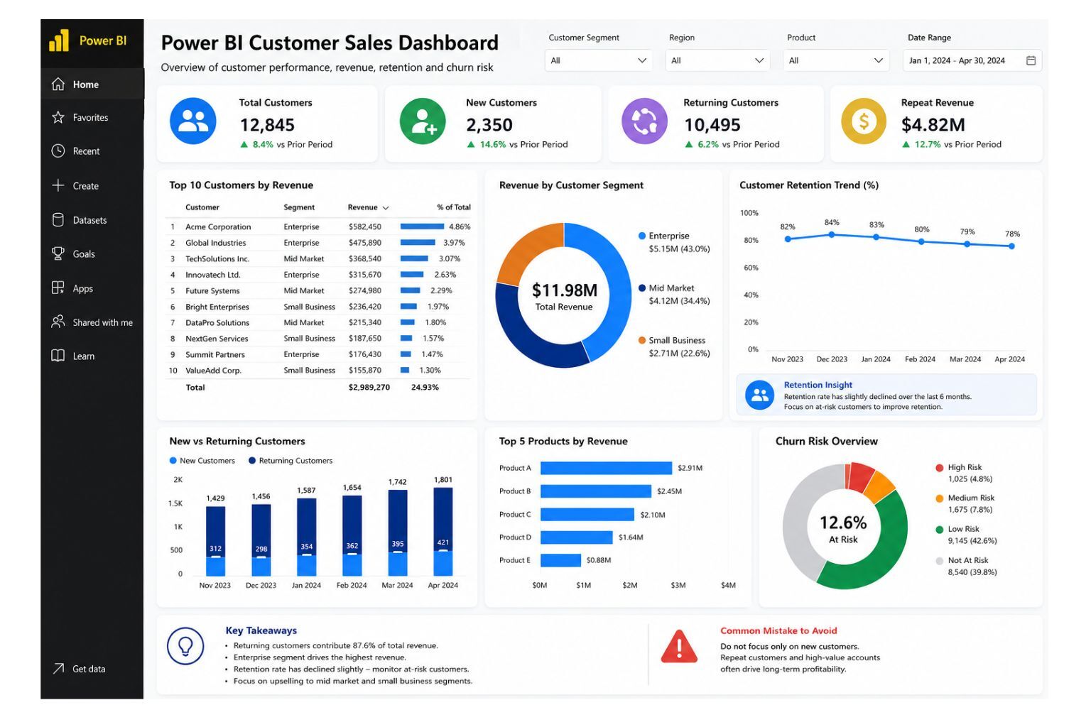
If your business wants to understand customer revenue, repeat buyers, and customer segments more clearly, DataScienceConsultingPro.com can build a custom customer sales dashboard. Request a quote now.
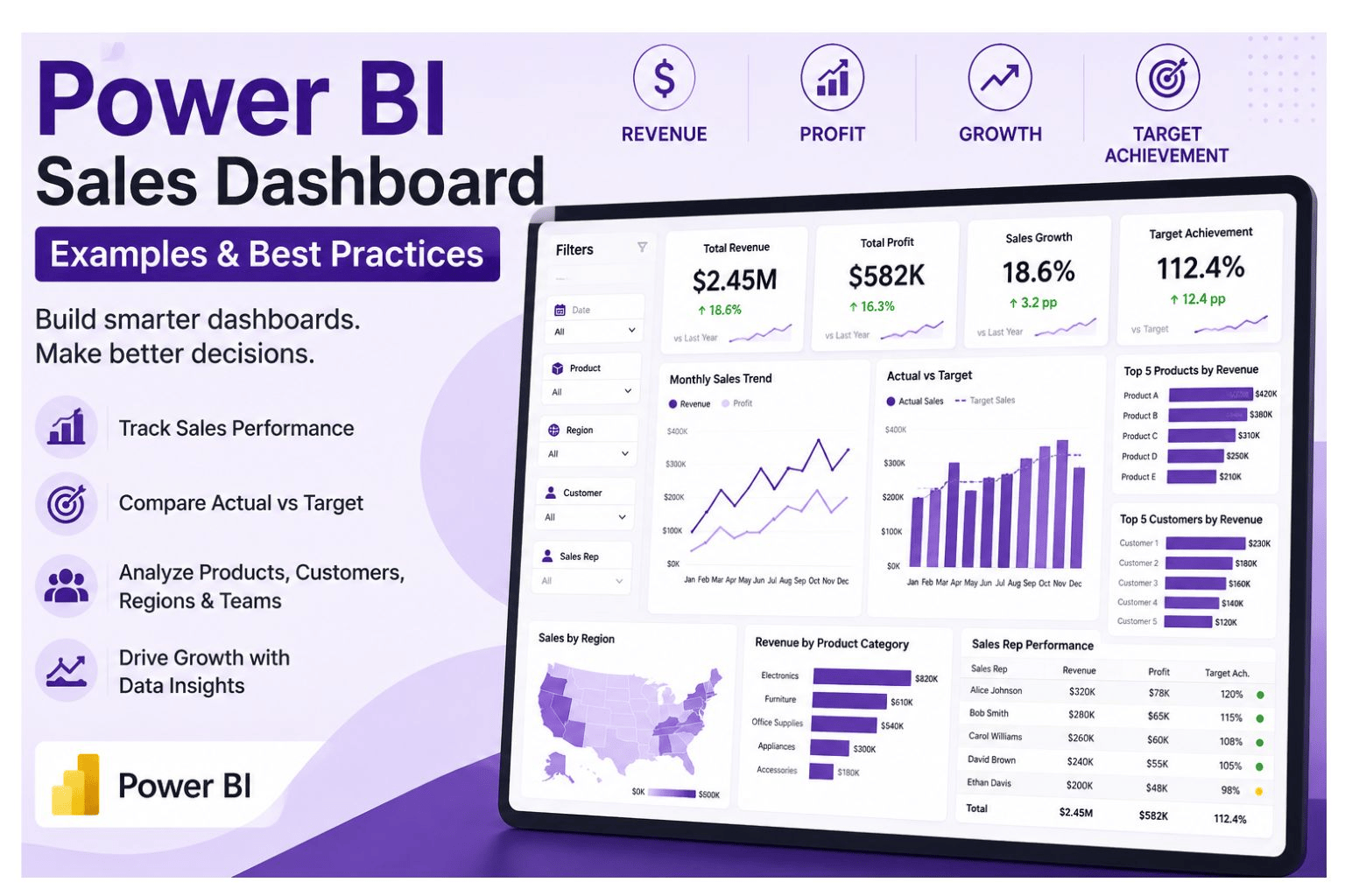
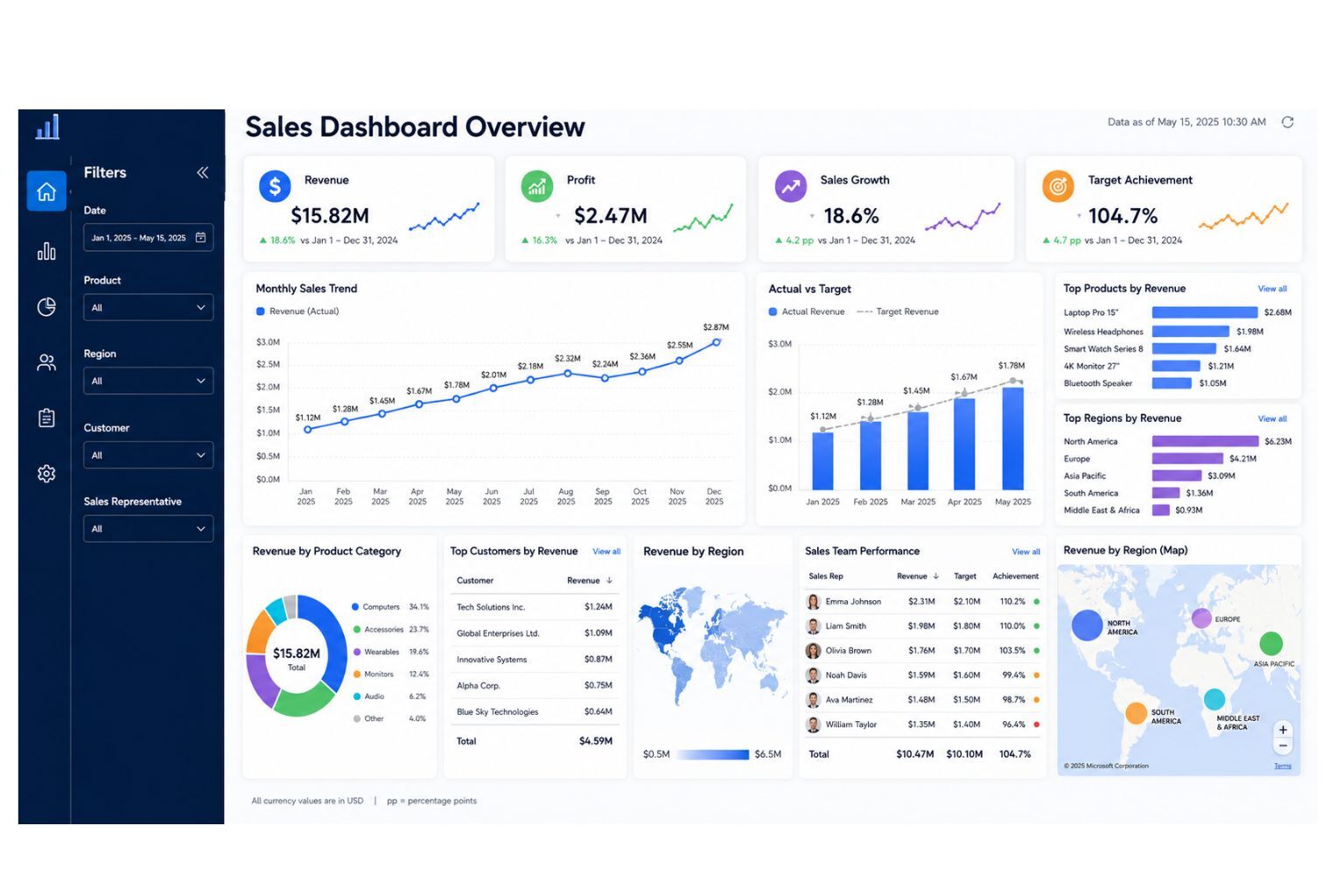
10. Power BI Sales Dashboard Overview Layout
A Power BI sales dashboard overview layout is the first page users see. It should give a clean summary of the most important sales metrics and guide users to deeper pages.
This dashboard helps users understand the overall sales position before drilling into products, regions, customers, sales representatives, or pipeline details. It should work like a control center for sales reporting.
Include these elements in the dashboard:
- Revenue KPI card
- Profit KPI card
- Sales growth KPI card
- Target achievement KPI card
- Monthly sales trend
- Actual vs target chart
- Product ranking
- Regional performance
- Customer ranking
- Sales representative summary
- Filters and slicers
Need a dashboard layout built around your company’s sales process? Visit our Power BI dashboard services page or request a custom Power BI dashboard quote now.
Which Power BI Sales Dashboard Example Should You Use?
Different companies need different dashboard types. A business owner may need an executive summary, while a sales manager may need team performance details. A SaaS company may need pipeline reporting, while a retail business may need product and regional sales analysis.
Use the table below to choose the right dashboard for your business.
| Dashboard Type | Best For | Main KPIs | Best Users | Recommended Data Sources |
|---|---|---|---|---|
| Sales Executive Dashboard | High-level sales overview | Revenue, profit, growth, targets | CEOs, founders, directors | Sales files, CRM, accounting data |
| Sales Performance Dashboard | Tracking overall sales activity | Sales growth, orders, variance | Sales managers, analysts | Excel sales reports, CRM, POS |
| Sales Pipeline Dashboard | Managing leads and opportunities | Pipeline value, win rate, expected revenue | Sales teams, B2B companies | CRM exports, lead data |
| Regional Sales Dashboard | Comparing locations and territories | Regional revenue, margin, targets | Branch managers, executives | Sales by location, branch data |
| Product Sales Dashboard | Understanding product performance | Product revenue, units sold, margin | Retail, eCommerce, manufacturers | Product master data, sales data |
| Sales Representative Dashboard | Comparing team performance | Revenue by rep, win rate, targets | Sales managers | Sales rep records, CRM |
| Revenue and Profit Dashboard | Measuring profitable growth | Revenue, cost, gross profit, margin | Finance teams, business owners | Sales data, cost data, accounting data |
| Sales Forecast Dashboard | Planning future sales | Forecasted sales, pipeline, targets | Executives, sales planners | Historical sales, CRM, pipeline data |
| Customer Sales Dashboard | Analyzing customer revenue | Top customers, retention, CLV | Account managers, marketing teams | Customer data, sales records |
| Sales Dashboard Overview Layout | One-page sales summary | Revenue, profit, targets, trends | All dashboard users | Combined sales data sources |
Power BI Sales Dashboard Layout Ideas
The best dashboard layout depends on the user. A CEO, sales manager, analyst, and account manager may need different views of the same sales data. Before designing the dashboard, decide who will use it and what decisions they need to make.
An executive summary layout works best when leaders need a fast overview of revenue, profit, targets, and growth. This page should be clean and should avoid unnecessary detail.
A sales manager layout works best when managers need to monitor reps, products, regions, branches, and targets. It should include filters, rankings, and drill-through pages.
A pipeline layout works best when the company manages leads, opportunities, and deal stages. It should show funnel movement, expected revenue, and win rate.
A product performance layout works best when product revenue, units sold, margin, and inventory planning matter.
A regional performance layout works best when a business operates across multiple branches, regions, stores, or territories.
A mobile-friendly layout works best when executives or field managers need to check performance on mobile devices. This version should use fewer visuals, larger KPI cards, and simple filters.
For broader business reporting ideas, read our guide on business dashboard.
Best Visuals for a Power BI Sales Dashboard
A good Power BI sales dashboard should use visuals that support decisions. Do not add visuals only because they look attractive. Each visual should help the user understand performance faster.
KPI cards work well for revenue, profit, sales growth, target achievement, and forecasted sales. Line charts are better for monthly trends, quarterly performance, and year-over-year comparisons. For products, regions, customers, and sales representatives, bar charts make comparisons easier to read. Maps should only be used when geographic performance matters.
Funnel charts work well for sales pipeline stages and lead conversion. Matrix tables are useful when users need detailed comparisons by customer, product, region, or sales representative. Slicers should be used for date, region, product, customer, branch, team, and sales representative.
A clean dashboard is more persuasive than a crowded dashboard. The goal is to help users understand performance quickly and take action.
Power BI Sales Dashboard Design Best Practices
A Power BI sales dashboard should be simple, accurate, and aligned with business goals. Good design improves trust and usability because users can quickly understand the numbers and act on them.
Follow these best practices:
- Start with business questions before designing visuals
- Choose KPIs before building charts
- Keep the executive page simple
- Show actual vs target clearly
- Include both revenue and profit where possible
- Use consistent number formatting
- Use clear page titles and chart labels
- Avoid unnecessary visuals
- Separate overview and detailed pages
- Validate every KPI formula
- Clean the data before dashboard development
- Use slicers that match how users analyze sales
- Optimize dashboard speed
- Test the dashboard with real users
- Add drill-through pages for deeper analysis
A dashboard should not make users guess what the numbers mean. Every page should guide the user toward a decision. If you need professional dashboard planning and design, visit our dashboard development services page.
Common Power BI Sales Dashboard Mistakes
Many sales dashboards fail because they look good but do not support decisions. The most common problem is not poor design alone. It is poor alignment between business goals, data quality, KPI logic, and dashboard usability.
Avoid these mistakes before publishing your dashboard:
- Tracking too many KPIs
- Focusing only on revenue
- Using unclear sales targets
- Overloading one page with too many visuals
- Ignoring data cleaning
- Failing to validate DAX measures
- Using screenshots instead of interactive dashboards
- Not aligning KPIs with business goals
- Using poor date filters
- Forgetting to test the dashboard with real users
Revenue is important, but it does not show the full picture. Where possible, include profit, margin, discount impact, and costs. If the dashboard ignores profitability, the business may end up chasing sales that do not create enough value.
If your dashboard data has duplicates, missing values, inconsistent names, or unstructured files, our data cleaning services can help prepare your data before dashboard development.
What Data Do You Need to Build a Power BI Sales Dashboard?
A dashboard is only as reliable as the data behind it. Before building a Power BI sales dashboard, prepare your sales data sources and check whether they are clean, complete, and consistent.
| Data Source | Example Fields | Why It Matters |
|---|---|---|
| Excel sales files | Date, product, quantity, revenue, customer | Common starting point for sales dashboards |
| CRM exports | Leads, opportunities, deal stage, sales rep | Supports pipeline and conversion reporting |
| POS data | Transaction ID, branch, item, payment, date | Useful for retail and store performance |
| ERP data | Orders, inventory, product cost, delivery status | Connects sales with operations |
| Accounting data | Revenue, cost, profit, invoice, expense | Supports profitability reporting |
| eCommerce data | Orders, carts, products, customers, channels | Useful for online sales analysis |
| Marketing leads data | Campaign, lead source, conversion status | Connects marketing and sales |
| Customer data | Customer name, segment, location, account type | Supports customer analysis |
| Product master data | Product ID, category, brand, cost | Supports product-level reporting |
| Sales target sheets | Rep target, region target, monthly target | Needed for actual vs target analysis |
| Sales rep data | Rep name, territory, manager, team | Supports team performance reporting |
You do not need perfect data before contacting DataScienceConsultingPro.com. We can review your files, clean your data, structure your tables, and prepare the dataset for Power BI dashboard development. Request a data cleaning and dashboard quote now.
Example Power BI Sales Dashboard Pages
A complete Power BI sales dashboard may include several pages. This helps keep the report organized and prevents one page from becoming too crowded.
Recommended pages include:
- Executive summary
- Sales performance
- Sales pipeline
- Product performance
- Regional performance
- Sales representative performance
- Customer analysis
- Revenue and profit analysis
- Forecasting
- Data quality notes
The executive summary should provide a simple overview. The detailed pages should allow users to analyze performance by product, customer, region, salesperson, or time period.
Power BI Sales Dashboard Development Process
DataScienceConsultingPro.com follows a structured process to make sure your dashboard is accurate, useful, and easy to use. The goal is not only to create charts, but to build a reporting tool that supports better sales decisions.
Our process includes:
- Understanding your sales reporting goals
- Reviewing your data sources
- Cleaning and preparing the data
- Building the Power BI data model
- Creating DAX measures
- Designing dashboard pages
- Adding filters, slicers, and drill-throughs
- Validating KPIs
- Publishing and sharing the dashboard
- Training users and providing support
We start by understanding what your business wants to track. This may include revenue, profit, targets, products, customers, regions, sales representatives, pipeline, or forecasts. We then review your Excel files, CRM exports, POS data, ERP records, accounting data, eCommerce data, or other business data sources.
After the data review, we clean duplicate records, missing values, inconsistent names, wrong date formats, and unstructured tables. We then build a reliable Power BI data model, create DAX measures, design dashboard pages, validate results, and prepare the dashboard for use.
For a complete dashboard development solution, visit our Power BI dashboard services page.
What You Receive When You Order a Power BI Sales Dashboard
When you request a custom Power BI sales dashboard from DataScienceConsultingPro.com, the goal is to give you more than a visual report. You receive a practical dashboard solution that your team can use to monitor performance, reduce manual reporting, and support better decisions.
Depending on your project scope, you may receive:
- A custom Power BI sales dashboard
- Power BI file or dashboard package
- Cleaned and structured dataset
- KPI cards and DAX measures
- Dashboard pages for sales, products, customers, regions, reps, or pipeline
- Filters, slicers, and drill-through pages
- Dashboard screenshots for reports or presentations
- KPI documentation explaining key calculations
- Data cleaning notes where applicable
- Refresh guidance or automation setup instructions
- User guidance or dashboard walkthrough
- Optional ongoing support and dashboard improvement
This helps you know exactly what you are ordering. It also shows that the service includes planning, data preparation, dashboard development, validation, and support. Request a dashboard proposal and deliverables list now.
How Much Does a Power BI Sales Dashboard Cost?
The cost of a Power BI sales dashboard depends on the size and complexity of the project. A simple dashboard from one clean Excel file costs less than a multi-page dashboard connected to CRM, accounting, ERP, sales targets, and customer data.
DataScienceConsultingPro.com uses proposal-based pricing because every business has different data sources, dashboard goals, and reporting needs.
A basic dashboard proposal is best for businesses with one clean data source, such as Excel or CSV. It may include one dashboard page, basic KPI cards, a sales trend chart, product or region breakdown, simple filters, and basic formatting.
A standard dashboard proposal is best for businesses that need a more complete sales report. It may include two to four dashboard pages, multiple KPIs, product analysis, customer analysis, regional analysis, sales representative analysis, data cleaning, DAX measures, interactive filters, and dashboard validation.
An advanced dashboard proposal is best for businesses with more complex reporting needs. It may include multiple data sources, advanced DAX calculations, sales pipeline analysis, revenue and profit reporting, forecasting pages, drill-through pages, automated refresh setup, and dashboard documentation.
An enterprise dashboard proposal is best for companies that need advanced business intelligence support. It may include CRM, ERP, POS, accounting, or eCommerce integration, multiple dashboards, department-level reporting, user access planning, performance optimization, executive dashboard design, training, support, and ongoing dashboard maintenance.
To get an accurate price, request a proposal quote. We will review your requirements, data sources, KPIs, dashboard pages, and timeline before giving you a clear estimate.
Request a Power BI sales dashboard proposal quote now
What to Include When Requesting a Proposal Quote
To receive a faster and more accurate proposal quote, send enough information for us to understand your business, data, and reporting goals.
You can include:
- Your business type
- Your current sales reporting method
- Available data sources
- Sample Excel file, CRM export, or sales report format
- KPIs you want to track
- Number of dashboard pages needed
- Whether data cleaning is required
- Whether automated refresh is needed
- Number of users who will view the dashboard
- Preferred dashboard style
- Deadline or delivery timeline
- Any dashboard screenshot or example you like
You can still request a quote even if your data is messy or incomplete. DataScienceConsultingPro.com can help you review, clean, and prepare your data before dashboard development begins.
Why Choose DataScienceConsultingPro.com?
DataScienceConsultingPro.com helps businesses convert raw data into dashboards, reports, and analytics solutions that support better decisions. We do not just create charts. We help you understand your data, choose the right KPIs, clean your files, build accurate measures, and design dashboards that business users can actually use.
Choose DataScienceConsultingPro.com if you need help with Power BI dashboard development, sales analytics dashboards, Excel to Power BI migration, data cleaning and preparation, DAX measure development, sales KPI reporting, business intelligence dashboards, dashboard automation, and sales forecasting.
Our goal is to help you reduce manual reporting, improve visibility, identify growth opportunities, and make faster decisions. If your sales data is spread across Excel, CRM exports, POS systems, accounting tools, or manual reports, we can help you bring it together into one clear Power BI dashboard.
Request your custom dashboard quote now
FAQs About Power BI Sales Dashboard Examples
A Power BI sales dashboard is an interactive report that helps businesses track sales performance, revenue, profit, targets, products, customers, regions, and sales team activity.
A Power BI sales dashboard should include revenue, profit, sales growth, target achievement, monthly trends, product performance, regional performance, sales representative performance, customer analysis, and filters.
The best KPIs include total revenue, gross profit, profit margin, sales growth, target achievement, average order value, win rate, pipeline value, top products, top regions, top sales representatives, and forecasted sales.
Yes. Power BI can use Excel sales data to create interactive sales dashboards. However, the Excel file should be clean, structured, and consistent for accurate reporting.
Yes. Power BI can be used with CRM exports and supported connectors depending on the CRM system, data access, and reporting setup.
Power BI is usually better for interactive dashboards, automated reporting, multiple data sources, visual analytics, and shared business reporting. Excel is still useful for data entry, simple calculations, and small manual reports.
A sales dashboard can have one page or several pages depending on complexity. Many businesses use an executive summary page plus detailed pages for sales performance, pipeline, products, regions, customers, and sales representatives.
The cost depends on data sources, dashboard pages, data cleaning needs, DAX complexity, automation, timeline, and support requirements. DataScienceConsultingPro.com provides proposal-based quotes.
Yes. DataScienceConsultingPro.com can build a custom Power BI sales dashboard using your sales data, KPIs, business goals, and reporting requirements.
A sales report usually presents static sales information for a specific period. A sales dashboard is interactive and allows users to filter, explore, and monitor sales performance more easily.
Conclusion
The best Power BI sales dashboard examples combine clean data, clear KPIs, interactive visuals, and business-focused reporting. A good dashboard should help managers understand revenue, profit, sales targets, products, customers, regions, sales representatives, pipeline, and future performance.
Dashboard examples are useful for inspiration, but the best dashboard is one built around your company’s sales process, data sources, goals, and decision-making needs.
Need help building a Power BI sales dashboard? DataScienceConsultingPro.com can clean your sales data, design your dashboard, create DAX measures, automate reporting, and deliver a dashboard your team can use with confidence.